

 Accordion
An Accordion is a stack of sections where one section is open at a time. Each section is a Unity Foldout: its text is the header, and its children are the content.
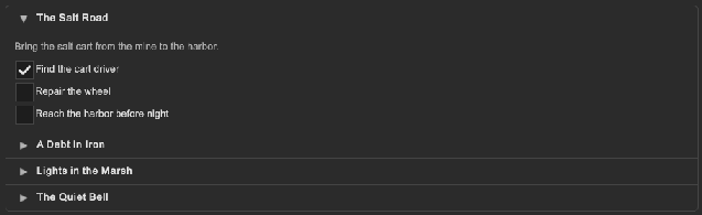
How to make an accordion for a list of questions:
<tb:Accordion name="faq">
    <ui:Foldout text="How do I save a game?">
        <ui:Label text="The game saves at each checkpoint." />
    </ui:Foldout>
    <ui:Foldout text="How do I change the keys?">
        <ui:Label text="Open Settings, then Controls." />
    </ui:Foldout>
    <ui:Foldout text="How do I play with a friend?">
        <ui:Label text="Open the Friends window and send an invite." />
    </ui:Foldout>
</tb:Accordion>
var faq = root.Q<Accordion>("faq");
faq.Opened += section => Debug.Log($"Opened: {section.text}");
faq.Q<Foldout>().value = true;
| Member | Description |
|---|---|
Multiple (multiple) |
Lets more than one section be open. False (the default) closes the other sections when one opens. |
Collapsible (collapsible) |
Lets the user close the open section, so that no section is open. False (the default) keeps one section open. It has no effect with Multiple. |
Animate (animate) |
Animates the height of a section that opens or closes. True (the default). |
Opened |
Raised after a section opened, with the Foldout of the section. |
- Each child
Foldoutis a section. To open or close a section from code, set itsvalue. - A
Foldoutis open by default. When the accordion attaches to a panel, it keeps the first open section and closes the other sections. Setvalue="false"on eachFoldoutto start with all sections closed. - A click on a header opens its section. Enter, Space and the submit button of a gamepad do the same for the header with the focus.
- Tab and the up and down keys of the keyboard or a gamepad move between the headers. Left closes the section of the focused header and right opens it.
- The header with the focus shows the focus border of the workspace.
- A
Foldoutor aTogglein the content of a section is not a section. It does not close the other sections. - A section opens and closes with a short height animation (180 ms, ease-out). At the end the content has its automatic height again, so a later change of the content resizes the section. Set
animate="false"to open and close at once. WithAnimationsEnabledoff on the workspace, there is no animation.
Tips:
- Use
multiple="true"for a settings page, where the user compares sections. - Use the default mode for a list of questions, where one answer shows at a time.
- With
collapsible="true", setvalue="false"on eachFoldoutfor a list that starts closed. - Keep the header text short. A long header does not wrap.
Styling
| Class | Element |
|---|---|
tb-accordion |
The control: a --tb-color-border border with --tb-radius-md corners. |
tb-accordion > .unity-foldout |
A section. It has a --tb-color-border line under it. |
tb-accordion > .unity-foldout > .unity-foldout__toggle |
The header: bold text, --tb-color-surface-hover on hover. |
tb-accordion > .unity-foldout > .unity-foldout__content |
The content, with --tb-spacing-md padding at the left, the right and the bottom. |
.tb-accordion > .unity-foldout > .unity-foldout__toggle { background-color: var(--tb-color-surface-alt); }