

 CommandPalette
A CommandPalette is a search box over the workspace that finds and runs a command. The user presses Ctrl+K, types a part of the command name, and presses Enter. It gives a keyboard user fast access to every action of your UI.
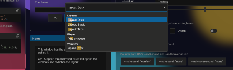
How to add a command palette:
- Add one
CommandPaletteto the workspace, in UXML or in code. It stays hidden. The shortcut works while the palette is in a panel. - Add the commands in code. Each command has a text and an action.
<tb:Workspace name="workspace">
    <!-- the windows -->
    <tb:CommandPalette name="palette" />
</tb:Workspace>
var palette = root.Q<CommandPalette>("palette");
palette.AddCommand("Save layout", SaveLayout, "Ctrl+S", "Layout");
palette.AddCommand("Reset layout", ResetLayout, group: "Layout");
var paste = palette.AddCommand("Paste", Paste, "Ctrl+V", "Edit");
paste.Enabled = false; // dim, and Enter passes over it
palette.Executed += command => Debug.Log($"Ran {command.Text}");
| Member | Description |
|---|---|
Shortcut (shortcut) |
The keys that open and close the palette from any control of the panel, such as "Ctrl+K" (the default), "Ctrl+Shift+P" or "F1". Command counts as Control. Empty turns the shortcut off. |
Placeholder (placeholder) |
The text of the empty search field. Without a value it is the ToolboxText.TYPE_A_COMMAND text. |
FuzzySearch (fuzzy-search) |
On (the default): "svl" finds "Save layout". Off: only a command that contains the typed text. |
ShowClearButton (show-clear-button) |
On (the default): the search field shows a "x" button while it has text, and a click clears the text. See Clear button. |
AddCommand(text, run, detail, group, icon) |
Adds a command and returns its ChoiceItem. detail shows muted on the right, for a shortcut or a hint. group is the header that the command shows under. |
AddCommand(item, run) |
Adds a command from a ChoiceItem. An item that is in the palette gets the new action. |
RemoveCommand(item), ClearCommands() |
Remove commands. |
Commands, Matches, Highlighted, Query |
All the commands, the ones that match the typed text, the one that Enter runs, and the typed text. |
Open(anchor), Close(), Toggle(anchor) |
Show and hide the palette from code, for example from a toolbar button. A palette in the hierarchy needs no anchor. |
Complete() |
Puts the text of the highlighted command in the search, with the caret at its end. Tab calls it. False when no enabled command is highlighted. |
Run(command) |
Closes the palette, runs the action and raises Executed. It does nothing for a disabled command. |
IsOpen, Opened, Closed, Executed |
The state and its events. |
- Up and Down move the highlight and pass over a disabled command. Enter, the gamepad submit button or a click runs a command.
- While the typed text is the start of the highlighted command, the rest of the name shows grey after it. Tab completes the name and does not run the command. The focus stays in the search.
- Escape, the shortcut again, or a press outside the dialog closes the palette without a command.
- The palette closes before the action runs. The focus is back in the control that had it, so the action can use that control or open another overlay.
- The shortcut does not open the palette while a
MessageBoxor another modal overlay is open. - The best match is first: a command that contains the typed text, then one that has its letters in order. The list is a
ChoiceList, so the rows have thetb-choice-listclasses. - The palette opens with an empty search field and all the commands.
Tips:
- Use one palette for each panel. Two palettes with the same shortcut both open. Give an extra palette
shortcut=""and open it from code. - Put the shortcut of a command in
detail. The palette shows the text; it does not register the shortcut. - Add commands for the windows of the workspace, as the WorkspaceDemo example does, so the user opens a window by name:
foreach (var button in workspace.Query<WorkspaceToolbarButton>().ToList())
{
    var id = button.WindowId;
    palette.AddCommand($"Open {button.Title}", () => _ = workspace.OpenWindowAsync(id), group: "Windows");
}
- For text in other languages, give the
tb.type-a-commandkey a text in yourToolboxTextsource. See the Localization example. - Keep the command texts short and start them with a verb. The user finds "Open Gauge" faster than "Gauge window".
Styling
| Class | Element |
|---|---|
tb-command-palette |
The overlay. It fills the workspace, uses --tb-color-overlay, and puts the dialog 10% from the top. |
tb-command-palette__dialog |
The dialog: 480 px wide (90% at most), with the surface color, a border and --tb-radius-md. |
tb-command-palette__search |
The search TextField. |
tb-command-palette__ghost |
The grey rest of the highlighted command, over the text of the search. It uses --tb-color-text-muted. |
tb-command-palette__list |
The list of commands. It also has tb-choice-list, so the rows use the tb-choice-list__* classes of "SearchDropdown". In the dialog it has no border and position: relative. |
tb-command-palette--hidden |
Opacity 0 and the dialog 12 px up: the start of the enter animation and the end of the exit. |
tb-command-palette--anim-in, --anim-out |
The transitions of opacity and translate on the overlay and the dialog. |
tb-modal |
Also on the overlay, only while the palette is open. |