

 Sidebar
A Sidebar is a vertical navigation for a settings screen, an inventory or the sections of an application. One item is the selected one, and your code shows the page for it.
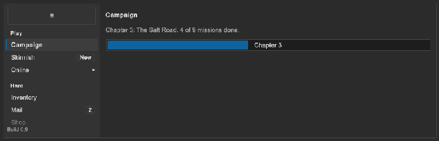
How to add a sidebar:
<ui:VisualElement style="flex-direction: row; flex-grow: 1;">
    <tb:Sidebar name="nav" toggle-shortcut="Ctrl+B">
        <ui:VisualElement class="tb-sidebar__header">
            <ui:Button name="navToggle" text="≡" />
        </ui:VisualElement>
        <tb:SidebarGroup text="Game">
            <tb:SidebarItem name="general" text="General" selected="true" />
            <tb:SidebarItem name="controls" text="Controls" badge="2" />
            <tb:SidebarItem text="Video">
                <tb:SidebarItem name="display" text="Display" />
                <tb:SidebarItem name="quality" text="Quality" />
            </tb:SidebarItem>
        </tb:SidebarGroup>
        <ui:VisualElement class="tb-sidebar__footer">
            <ui:Label text="v1.0" />
        </ui:VisualElement>
    </tb:Sidebar>
    <ui:VisualElement name="pages" style="flex-grow: 1;" />
</ui:VisualElement>
var nav = root.Q<Sidebar>("nav");
nav.ItemSelected += item => ShowPage(item?.name);
root.Q<Button>("navToggle").clicked += nav.Toggle;

// Items from code
var account = new SidebarGroup("Account");
account.Add(new SidebarItem("Profile", profileIcon));
var friends = new SidebarItem("Friends");
friends.Badge.Count = 3;
friends.Badge.Tone = BadgeTone.Accent;
account.Add(friends);
nav.Add(account);
nav.Selected = friends;
Sidebar:
| Member | Description |
|---|---|
Selected |
The selected SidebarItem, or null. Setting it raises ItemSelected. A sub-item expands its parent. |
Collapsed (collapsed) |
Shows the icons only. The text of an item is its tooltip. |
Toggle() |
Changes Collapsed to its other value. |
Flyout |
The ContextMenuComponent that shows the sub-items of a parent item in the icon-only mode. Null until it first shows. |
ToggleShortcut (toggle-shortcut) |
A shortcut that calls Toggle, such as Ctrl+B. Empty (the default) is no shortcut. |
Side (side) |
Left (the default) or Right. It sets the side of the border and of the mark of the selected item. |
Items |
All items in order. A sub-item comes after its parent. |
ItemSelected |
Action<SidebarItem?>, raised when Selected changes. |
CollapsedChanged |
Action<bool>, raised when Collapsed changes. |
SidebarGroup:
| Member | Description |
|---|---|
Text (text) |
The label above the items. Empty shows no label. |
SidebarItem:
| Member | Description |
|---|---|
Text (text) |
The text. |
Icon (icon) |
The image left of the text (a Background). |
BadgeText (badge) |
The text of the badge, such as "New" or "3". Empty (the default) hides the badge. |
Badge |
The Badge right of the text. Set its Tone or its Count in code. |
Selected (selected) |
True for the selected item. |
Expanded (expanded) |
Shows the sub-items. |
HasSubItems, ParentItem |
True for an item with sub-items; the parent of a sub-item, or null. |
- The children of a
SidebarareSidebarItemandSidebarGroupelements. The children of aSidebarGroupare items. TheSidebarItemchildren of an item are its sub-items. Use one level of sub-items. - A click on an item without sub-items selects it. A click on an item with sub-items expands or collapses it and does not select it.
- A click on the selected item raises nothing.
- A child of the sidebar with the class
tb-sidebar__headeris the header. A child with the classtb-sidebar__footeris the footer; it stays at the bottom. They can hold any element, such as a logo, a toggle button or aUserAvatar. - In the icon-only mode, the group labels, the texts, the badges and the sub-items do not show. An item without an icon shows the first letter of its text. A click or Submit on an item with sub-items shows them in a flyout menu beside the item, with the text of the item as the heading. A pick selects the sub-item, and the sidebar stays narrow. A second click closes the flyout. The flyout opens to the right, or to the left for a sidebar on the right side.
- The place of the sidebar comes from its parent. Put it first in a row for the left side, and last with
side="Right"for the right side. - Keyboard and gamepad: Tab goes to the selected item, or to the first one. Up and Down move between the items that show. Right expands an item and Left collapses it. Left on a sub-item goes to its parent. Enter or the Submit button selects the item or expands it. At the first and the last item, Up and Down leave the items as usual. Left and Right on an item with nothing to expand or collapse move the focus as usual, so a gamepad goes from the sidebar to the page.
- The toggle shortcut works while the sidebar is on the panel. It does not run while a text field has the focus.
- A disabled item (
enabled="false") shows dimmed, and the arrows pass over it. - The sidebar does not scroll. For more items than fit, put the groups in a
ScrollViewchild between the header and the footer. The ScrollView scrolls to the item that the arrow keys or Tab focus.
Tips:
- Give each item a
nameand use it to find the page, so a change of the text or a translation does not break the navigation. - Give each top-level item an icon when you use the icon-only mode. A letter is only a fallback.
- Use a white image for an icon. The sheet tints it with the text color of the theme.
- Save
Collapsedwith your settings inCollapsedChanged, and set it again at the start.
Styling
| Class | Element |
|---|---|
tb-sidebar |
The sidebar: 200 px wide, on --tb-color-surface-alt, with a border on the right. |
tb-sidebar--collapsed |
The icon-only mode: 44 px wide. |
tb-sidebar--right |
Side is Right: the border and the mark of the selected item change sides. |
tb-sidebar__header, tb-sidebar__footer |
Your header and footer elements. |
tb-sidebar__group, tb-sidebar__group-label |
A group and its label. |
tb-sidebar__item |
An item: its row and its sub-items. |
tb-sidebar__item--selected |
The selected item. Its row has the hover color, an accent mark on the side and bold text. |
tb-sidebar__item--expanded |
An item that shows its sub-items. |
tb-sidebar__item--parent |
An item with sub-items. Its row shows the arrow. |
tb-sidebar__row |
The row of an item. It takes the focus, and its border is the focus ring. |
tb-sidebar__icon |
The icon, 16 px. |
tb-sidebar__icon--letter |
The icon of an item without an image. It shows a letter in the icon-only mode. |
tb-sidebar__content |
The text, the badge and the arrow of a row. The icon-only mode hides it. |
tb-sidebar__text, tb-sidebar__arrow |
The text and the arrow of a row. |
tb-sidebar__sub-items |
The sub-items of an item, with a left margin. |
To make the sidebar wider and fill the selected row with the accent color:
.tb-sidebar { width: 260px; }
.tb-sidebar__item--selected > .tb-sidebar__row { background-color: var(--tb-color-accent); }
.tb-sidebar__item--selected > .tb-sidebar__row .tb-sidebar__text { color: var(--tb-color-accent-text); }