

 HoverCard
A HoverCard is a popup with your content that opens when the pointer rests on a control, or when the control gets the focus. Use it for the details of the thing under the pointer, such as the stats of an item in an inventory. For a text only, use a ToolTip.
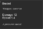
How to add a hover card in UXML:
- Declare the card in the UXML of a window. Put its content in it as child elements.
- Set
targetto the name of the control that opens it. No code is necessary.
<ui:Button name="swordSlot" text="Sword" />
<tb:HoverCard target="swordSlot" title="Iron sword" text="A plain blade.">
    <ui:Label text="Damage 12" />
    <ui:Label text="Weight 3" />
</tb:HoverCard>
How to use one card for many controls:
var card = new HoverCard { OpenDelayMs = 300 };
var stats = new Label();
card.Add(stats);
foreach (var slot in slots) card.AttachTo(slot);
// The card opens for one slot at a time: fill it from its target
card.Opened += () =>
{
    var item = (Item)card.Target.userData;
    card.Title = item.Name;
    stats.text = $"Damage {item.Damage}";
};
A HoverCard is a Callout. It has all the members of the Callout, and these:
| Member | Description |
|---|---|
OpenDelayMs (open-delay-ms) |
The time that the pointer rests on a target, or that the target has the focus, before the card opens, in milliseconds. 500 by default. |
CloseDelayMs (close-delay-ms) |
The time from when the pointer leaves the target and the card until the card closes, in milliseconds. 300 by default. |
TargetName (target) |
The name of the control that opens the card. The card attaches to it when it is added to a panel. |
AttachTo(target) |
Makes target open the card. Call it for each control that the card serves. |
Detach(target) |
Stops target from opening the card, and closes the card that is open for it. |
Title (title), Text (text) |
The bold first line and the text above the content, as on a callout. |
Placement (placement), Alignment (alignment) |
The side of the target and the place along that side. Below and Center by default. |
Target |
The control that the card is open for. |
- The card opens after the pointer rests on a target for the open delay. A pointer that only passes over the target opens nothing.
- The card stays open while the pointer is on the target or on the card. So the user can move the pointer to the card and use a control in it.
- The card closes after the close delay when the pointer leaves both. When the pointer goes to another target, the card moves there at once.
- The card also opens when a target gets the focus from the keyboard or a gamepad. It closes when the target loses the focus.
- Escape and the gamepad cancel button close the open card. The window or the dialog around the target stays open.
- The card does not take the focus. The focus stays on the target.
- A drag over a target, with a button held, opens no card.
- A card declared in UXML does not show in its place. It moves to the workspace while it is open.
Tips:
- Use one card for a grid of items and fill it in
Opened. One card is lighter than one card for each slot. - Keep controls out of a card that keyboard and gamepad users need. The focus does not go into the card, so its controls are for the pointer only.
- Set
CloseDelayMshigher when the card is far from its target, so the pointer has time to reach it. - A
HoverCardis the "open on hover" mode of aCallout. Use aCalloutwhen your code decides when the popup opens.
Styling
| Class | Element |
|---|---|
tb-hover-card |
The card. It also has the class tb-callout and its parts. It is on --tb-color-surface with a border in --tb-color-border. |
tb-callout__title, tb-callout__text |
The bold title and the text, above the content. |
tb-callout--hidden, --anim-in, --anim-out |
The enter and exit animations, as on a callout. |
To make every hover card wider, with a round border:
.tb-hover-card.tb-callout {
    max-width: 420px;
    border-radius: 12px;
}