
Text classes
The text classes give a Label the look of a heading, a lead text, a secondary text or inline code. They are in WindowStyles.uss, so they work on each label in the workspace.
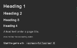
How to make the head of a page:
<ui:Label text="Graphics" class="tb-text-h1" />
<ui:Label text="Settings for the picture quality and the screen." class="tb-text-lead" />
<ui:Label text="Display" class="tb-text-h3" />
<ui:Label text="The changes apply at once." class="tb-text-muted" />
<ui:VisualElement style="flex-direction: row;">
    <ui:Label text="Start the game with" />
    <ui:Label text="-screen-fullscreen 0" class="tb-text-code" />
</ui:VisualElement>
var title = new Label("Graphics");
title.AddToClassList("tb-text-h1");
| Class | Look |
|---|---|
tb-text-h1 |
Heading 1: bold, 24 px. |
tb-text-h2 |
Heading 2: bold, 20 px. |
tb-text-h3 |
Heading 3: bold, 17 px. |
tb-text-h4 |
Heading 4: bold, in --tb-font-size-lg. |
tb-text-lead |
The text under a page title: --tb-font-size-lg in --tb-color-text-muted. |
tb-text-muted |
Secondary text: --tb-font-size-sm in --tb-color-text-muted. |
tb-text-code |
Inline code: the monospace font on a --tb-color-surface-alt background with --tb-radius-sm corners. |
- The headings and the lead text wrap.
- The headings have the text color of the theme.
- The classes set no margin. The space between the lines comes from the parent or from your sheet.
Tips:
- Use one
tb-text-h1on a page, andtb-text-h2totb-text-h4for the parts under it. - For code in the middle of a sentence, put the labels in a row, as in the example. A label has one font, so one label cannot mix a text font and the code font.
- For more than one line of code, use a
CodeBlock. - To change a size for all pages, override the class in your sheet:
.tb-text-h1 { font-size: 32px; }