
Example scenes
The scenes in Assets/UIToolbox/Examples/Scenes show other setups. Their files are in Assets/UIToolbox/Examples, in a folder for each scene. The helpers that several scenes use (SampleUI, SampleScreen, SampleNavigation and others) are in Shared. Each scene has one controller on its UI GameObject.
| Scene | Controller | Shows |
|---|---|---|
Units.unity |
UnitsController |
An RTS field of 240 units. Click a unit, Shift click to add, or drag a box to select. One inspector window shows the selection: one unit, or a UnitGroup with the count and averages. A sortable DataGrid lists the units and follows the selection. |
Factory.unity |
FactoryController |
A dashboard of six machines: live values in a DataGrid, gauges in each machine window, a temperature Graph, an output PieChart, dock zones on the left and right, and a notification when a machine gets hot. Arrange tiles the four screens in a grid. |
Bindings.unity |
BindingsController |
Converters and two-way bindings, with no format or animation code. One SampleHero is the data source of the workspace. The Hero window shows it through tb: groups (upper, display-name, n0, percent, hidden, duration, bytes, datetime, hex, visible). The Edit window edits it two-way (enum-int, not, hex, xz, has-value). AnimateBinding flashes the gold, shakes the card on a hit and pulses the health bar under 30%. A click on a shape of the scene (OpenWindowOnClick) or on Edit in the Shapes grid opens the window of the shape: a slider, a ColorPicker and toggles bind two-way to the public fields of SampleShape, and a PropertyGrid shows the same object. The shape reads its fields each frame, so an edit changes the scene at once. |
Kingdom.unity |
KingdomController |
A medieval RTS screen: the stock windows and toolbar in carved wood frames, parchment and stone buttons, with the Cinzel font (Kingdom.uss, see Restyle the chrome with images). The toolbar is the resource bar. Company shows the selected knight (data-source-path="Selected"), The Keep builds, the chronicle slides in each line, and the map binds each marker to a knight with tb:percent, and a click near a marker selects its knight. Custom presets: the food glows red while starving, the marker of the selected knight beats, the gold jumps and bounces as a coin. KingdomSounds plays soft plucks and chimes, and a coin on each gold change (sound="coin"). The Sound window sets the volume and the mute of the game through AudioOptions. The windows show the button attributes: the chronicle has show-close-button="false", the map has show-max-button="false" and resizable="false", the Sound window has only a close button. The drag hints (snap preview, merge border, dock border) have the colors of the look, not the blue of the dark theme. |
Firefight.unity |
FirefightController |
A first person shooter HUD: glass panels with neon lines and a cut corner, the Rajdhani and Share Tech Mono fonts, a crosshair over a night city (Firefight.uss). The toolbar holds the squad scores and the match clock (tb:duration). Weapon shows the weapon in hand (data-source-path="Weapon", slides up on a swap), Vitals shakes on each hit, Scoreboard is a DataGrid sorted by score, the kill feed slides in each line. Custom presets: the ammo blinks while low, the vitals glow red while the health is low, the crosshair flashes a red hit marker on each kill. FirefightSounds plays square blips and noise clicks, and a hit sound on each kill. The Radar window has enable-scrolling="false": a blip on the rim extends out of the radar, and a scroll view shows a scroll bar for it. |
Inventory.unity |
InventoryController, ShapedInventoryController |
Two game inventories in one workspace, as three windows: Inventory, Item and Shaped items. Bag and equipment: a bag of 6 by 4 slots and four equipment slots. Each slot has a DragSource and a DropTarget. A drag moves an item, fills a stack of the same item, or swaps two items. An equipment slot takes only its kind, and shows the denied class during a drag of another kind. Each item has a ToolTip with the name as the header and a rich text body with the rarity color. The Item window shows the selected slot, with Use (drink, equip or unequip) and Sell. The keyboard and the gamepad move between the slots; submit picks up an item and puts it down, cancel keeps it. The toolbar shows the gold, the value and the weight. The Style field of the toolbar changes the look of all the windows with one class. The model is SampleInventory; the controller only shows it. Shaped items: an inventory for items of different shapes: a backpack of 8 by 6 cells and a chest of 5 by 6 cells. Each item uses one or more cells (ShapedItem, ShapedGrid). A DragSource on each item gives the ghost; the controller colors the cells under the ghost green when the item fits and red when it does not, and puts the item there on the release. R, the right mouse button or the Turn button turns the item; the left button stays down and the drag goes on. Arrange puts the items of the backpack again from the top left. With a keyboard or a gamepad, submit picks an item up, the arrows move it and submit puts it down. The toolbar shows the cells in use. The same Style field changes the look (Classic, Sci-fi, Parchment). The How it is made column has a tab for each use case (drag and turn, keyboard and gamepad, look), each with its UXML and its C#. The last line of the C# follows the demo: the last drop, the item in the hand and the look class. |
Dialogue.unity |
DialogueController |
A dialogue box: a portrait with the first letter of the speaker, the speaker name, the line in a TypewriterLabel, and a button for each choice. Submit (Enter, Space or the gamepad South button) or a click on the box shows the whole line while it types, then goes to the next line. When a line is complete, its choices take the focus; Up and Down move between them and wrap, and submit picks one. The last line offers "Talk again.". The conversation is SampleDialogue: lines with an id, a speaker, rich text, the next line or the choices. |
SaveLoad.unity |
SaveLoadController |
A save and load screen. The World window shows the place of the player and the play time; Travel goes to the next place. The Save / Load window has four slot buttons: an Image thumbnail that ElementImage.Capture took of the world, the place, the date and the play time. In Save mode a slot saves the game; over a saved game a MessageBox asks first, and Cancel has the focus. In Load mode a slot loads its game, and the empty slots are disabled. The ✕ button of a slot deletes its game after a MessageBox asks. The keyboard and the gamepad move between the slots and the ✕ buttons. The games are SaveSlot objects in memory. |
QuestJournal.unity |
QuestJournalController |
A quest journal. A DataTree on the left shows the quest groups and their quests; the arrow keys or the gamepad move the selection. The right side shows the selected quest: the giver, the story, and the steps with ✓ for a done step and ▶ for the current step. A Timeline has a track for each step, colored done, current or pending, and the playhead at today. A selected group keeps the quest that shows. The quests come from SampleQuests. |
GridDemo.unity |
GridDemoController |
GridPanel step by step, in four tabs. Playground: a field for each setting of a panel (columns, rows, auto-rows, gap, auto-flow, justify-items, align-items), six start points with a note, items that span columns and rows, the place of each item (GetPlacement), the size of each track (ColumnSizes, RowSizes) and a pale box for each cell. HUD: named areas (areas, GridCell.Area); one button changes the areas text and all the cells move. Form: columns auto 1fr for labels and fields, and the same children as two pairs in a row. Cards: repeat(auto-fill, minmax(120px, 1fr)) follows the width of the window, with auto-fit to compare. Each tab shows the UXML of its panel in a CodeBlock (GridDemoController.Describe). |
TemplateDemo.unity |
TemplateDemoController |
An editor for one window template (WindowTemplateDefinition). Three tabs show the same template: Fields (a PropertyGrid), JSON (the text for RegisterTemplates) and C# (the code, in a CodeBlock). Five start points with a note: a ship card, a second UXML file as a part, a title that computes ({100 - Hull:0}), no formats, and the workspace cascade. Each change registers the template and makes the open ship windows again with RemoveWindowAsync, because a window keeps the template it was made with. A preview line shows the title and the window id that the formats give. Buttons open a window for each ship, change the data (the titles and the bindings follow), group the windows as tabs and remove them. A wrong field shows the error text and keeps the last good template. In UXML: an tb:WindowTemplateElement makes a crew window for each ship, and a closed Window with title-format shows only the last ship. Built in code: a WindowTemplate whose CreateContent builds a scan card with no UXML file. Each tab has a "How it is made" column with its UXML and C# in CodeBlock controls; the code follows the values of the fields. |
NotificationDemo.unity |
NotificationDemoController |
The toasts of Workspace.Notifications (NotificationArea, NotificationBubble) and Alert, step by step. Kinds: Show(message, severity, durationMs) with the four Severity values, Title and Detail. Time: DurationMs (0 stays), ShowProgress, Closable, the pause under the pointer and RemainingMs. Click and actions: Clicked with focusable opens the Quest log window through OpenWindow, AddAction adds Accept and Decline buttons, and ShowTask shows a spinner and then the result. Burst: MaxVisible, Queue, QueuedCount and DismissAll, with a note on the sound. Corner: the six NotificationCorner places. Looks: an achievement card with a badge and a kill feed line, from a class on the bubble and the rules in NotificationDemo.uss. The Ship window has Alert banners that stay in the layout: Severity, Title and Message follow a power slider, a child button is the action, and Closable, Open, Close and Closed handle the notice. A status label counts the events (shown, clicked, dismissed, timed out), and a CodeBlock shows the C# of the last toast. |
RadarDemo.unity |
RadarDemoController |
Radar step by step, in six tabs and a HUD window. All radars show one world: seven contacts that go around the player (RadarContact.Position); Step moves them and a toggle stops them. Minimap: a class for each kind of contact (friend, enemy, neutral), range, clamp-to-edge for a contact out of range, and the contact below the pointer or the selected contact in a status (WorldToRadar). Heading: north up next to heading up (Heading, rotate-with-heading). View cone: view-angle and view-range with four start points (guard, forward scanner, lantern, no limit), the contacts in view (IsInView), and a class that hides the others. Sonar: pulse, pulse-seconds, Ping and sweep; pulse-reveal keeps a blip dark until the ring reaches it, and a toggle turns it off, and ContactPinged writes the status. Scope: sweep-reveal shows a contact only as the sweep passes it, then the contact fades over sweep-fade-seconds (0: one turn); a toggle turns the reveal off and sliders change the sweep and the fade. Looks: the same radar with the theme, a green phosphor class and a clean sci-fi class. The HUD radar window shows the same world on a small radar with heading up. Each tab shows the UXML of its radar in a CodeBlock (RadarDemoController.Describe). |
PieChartDemo.unity |
PieChartDemoController |
PieChart step by step, in one window with six tabs. Drill-down opens the parts of a slice of a colony budget, three levels deep (category, building, item): SliceClicked gives the slice, SetData shows its parts, and a Breadcrumb goes back up (Push, Navigated, NavigateTo). Donut and labels has a field for each text setting: inner-radius, center-label (the total, or the selected slice), start-angle, value-format, show-labels, show-percentages, show-legend and gradient. Live data changes a fleet with sliders and buttons: SetData with the same labels keeps the slices and the selection, and Animate moves them to their new shares. Events reports SliceHovered, SliceSelected and SliceClicked in labels, sets SelectedSlice from buttons and turns interactive off. HUD size shows three small pies in buttons (show-legend, show-labels and interactive off, explode-offset 0) next to a large chart. Custom look restyles the chart from USS with two looks (--tb-pie-stroke, the legend and label classes) and sets PieSlice.Color. A CodeBlock shows the C# or the UXML of the live chart. |
CalloutDemo.unity |
CalloutDemoController |
Callout and its relatives in two windows. Tutorial: one callout goes over five parts of a HUD; each step sets Title, Text, Placement, Alignment and calls Open(target), with connector, highlight-target, tip-size and draggable (GoTo, Next, Back on the controller). Sides: placement, alignment, tip-size, severity, look and Toggle. Line: the USS variables --tb-callout-connector-color, -width and -cap, highlight-target, and a drag that leaves Side at Free. Field: FieldError.Show, Clear, Has on a form that checks itself. Items: one HoverCard for four items, filled in Opened from Target (AttachTo, open-delay-ms), next to a plain tooltip. Tooltips: ToolTip with header, placement and tooltip-class, in four colors and three looks. Looks: a speech bubble (look="Talk") and a scanner tag with lock-on brackets (target-box) from USS classes. 3D target: a camera draws a scene that the controller makes at runtime into a render texture in the tab; a lock-on with TargetRenderer, target-box and clamp-to-edge follows a sphere that flies behind the camera, the NPC has a Talk bubble (TargetWorld), the cube a Thought bubble and the pillar a label (TargetWorldPosition). The controller destroys the scene in OnDestroy. A status line reports Opened and Closed, and a CodeBlock shows the UXML or C# of each live callout. |
GaugeDemo.unity |
GaugeDemoController |
The meters of the toolbox in one window with six tabs. Dashboard: four Gauge controls (MinValue, MaxValue, Value, DisplayMode Arc or Needle, Divisions, MinorTicks, FormatString, Animate off) show a car that a throttle slider drives through Step(seconds); at a gear change the engine speed falls at RPM_RATE, so the needle of the tachometer moves down and does not jump; Ranges gives each gauge colored zones in the theme colors, and the arc or needle takes the color of the zone that holds the value. Character: ProgressRing (Value, Thickness, ShowText, Animate) for health, shield and stamina with a Label child for the number, a USS class that turns the health ring to the danger color at 25 or less, the ProgressBar of Unity with the same health, and a cooldown ring around an ability button that is disabled for 3 seconds. Power meter: the zones of a gauge are a golf swing; a perfect hit makes the green zone smaller. Playground: sliders and toggles for each setting of a gauge and a ring (value, min, max, thickness, divisions, minor ticks, size, format, needle, animate, labels, value text, zones, Indeterminate), four start points, and the UXML in a CodeBlock. Loading: IndeterminateProgress.Set and ProgressRing.Indeterminate for a connection of unknown length, then a download with a value; Skeleton in each Shape (Circle, Text with Lines, Block, Animated) holds the place of a panel that Reload fills after a delay. Sizes and looks: rings from 16 to 72 px and gauges from 80 to 160 px, and two looks (Neon, Brass) from one USS class that sets color, --tb-gauge-track, --tb-gauge-tick, --tb-progress-ring-track and the parts of the ProgressBar. Each tab has a "How it is made" column with its UXML and C# in CodeBlock controls; the code follows the values of the fields. |
RadialMenuDemo.unity |
RadialMenuDemoController |
RadialMenu step by step, in four tabs and a second window. Weapon wheel: icons drawn in code, a disabled wedge for a weapon with no ammo, and the chosen weapon in a HUD label. Build menu: a category folds out a second ring of buildings (SubItems, OpenItem), gold enables each building, and a slider sets sub-ring-size. Wedges and sizes: the number of wedges, inner-radius, the size, the toolbox style, animate and cancel-text, changed live. Looks: a sci-fi thin ring and a parchment disc, each from the six USS variables. Command wheel: a wheel that opens at the pointer on a right click or while Q or the left shoulder is held, takes the right stick (Point), and cancels from the center, Escape, a click outside or a release with no wedge. Each wheel reports HighlightChanged, ItemChosen and Cancelled in a status label and shows its code in a CodeBlock (RadialMenuDemoController.Describe). |
DataGridDemo.unity |
DataGridDemoController |
DataGrid step by step, in eight tabs with game data. Roster: column formats, SortByColumn, ClearSort, AllowSorting and GroupBy with collapse and expand. Market: SearchText, SetFilter per column, a SetCellRenderer cell with a class for gain and loss, and a footer with SetFooter. Leaderboard: PageSize, ShowPagination, Page and the parts of the Pagination (first and last buttons, texts, page size selector, sibling count). Units: the cell editors (text, number, enum and Choices dropdown, toggle), a label for a member without a setter, a button column with CellClicked and SetValue, and ReadOnly. Selection: SelectionMode, SelectionColumn and SetSelection; SelectionChanged fills a detail panel and ToCsv(true). Compare: select two or more ships, then Compare. ShowData opens a new window whose data is the list of ships, so title-format="Compare {Count} ships" formats the list. The window has a grid and two PieCharts of the ships in the list. Columns: AllowColumnResize, AllowColumnReorder, AllowColumnHide, ShowColumnMenu and SetVisibleColumns. Signal log: 500 to 50000 rows with few row elements, RowHeight, and a terminal look in USS (data-grid-demo-terminal). Each tab has a status line, and most have a CodeBlock with the C# of its grid (DataGridDemoController.Describe). |
ChartsDemo.unity |
ChartsDemoController |
Graph and SpiderChart in game uses, in two windows of tabs; each tab shows the UXML of its chart from the live values in a CodeBlock. Live: a gold income graph that scrolls: GraphSeries.MaxPoints and AddPoint drop the oldest sample, DataPointAdded reports each one, with a pause, a single step, ClearPoints and a slider for the samples kept. Series and kinds: three series with Categories, drawn as each GraphType (ChartType), with Stacked, ShowValues, ShowLegend, GraphSeries.Hidden from toggles or the legend, and SelectPoint, DataPointSelected and DataPointHovered in the status. Axes: SetAxisRange, ShowGrid, GraphSeries.SecondaryAxis with Y2Title, YFormat, SetAxisTitle, and SetView, ResetView, IsZoomed and ViewChanged. Sparklines: a market list with a 130 x 26 Graph in each row (ShowGrid, ShowLegend and Interactive off, four USS rules) next to a large graph filled with SetData. Compare: two weapons on six SpiderAxis, Value against Compare with ShowCompare, a slider for each axis, and ValueText; Animate with a slider for AnimationDuration, and a button that swaps the two weapons so that the shape moves. Skill wheel: AddAxis and RemoveFromHierarchy change the number of axes from three to eight, with Rings, MaxValue, LabelSpace and ValueFormat, in a round look from theme variables. Looks: both charts in the theme look and two custom looks, through the --tb-graph-* and --tb-spider-chart-* variables and GraphSeries.Color. |
ChatDemo.unity |
ChatDemoController |
ChatView in five tabs, with a second window that shows the C# of the last message in a CodeBlock (ChatDemoController.Describe). Party chat: Add puts the message of the user on the right, and a member answers after a short time; the answer is in the list at once as "..." and Update gives it its text and time. An AvatarGroup (max, Refresh) shows the members, and a toggle sets show-avatars. Channels: one view for three lists (Clear, Add), with a Badge (Count, Corner) on each channel button for the messages not read. Combat log: the class chat-demo-log removes the bubbles and puts the time in front of the rich text, with ChatSide.System as the headline of a wave. Quest giver: each answer is a button, and the class chat-demo-talk makes speech bubbles and square portraits. History and limit: MaxMessages, IsAtEnd, NewCount, ScrollToEnd, and OlderMessagesRequested with Prepend. Each tab has a "How it is made" column with its UXML and C# in CodeBlock controls; the code follows the values of the fields. |
DataTreeDemo.unity |
DataTreeDemoController |
DataTree by use, in a window with four tabs and a Skill tree window. Ship is a hierarchy with a detail panel: SetRoots, SelectionChanged, SelectedItem and ParentOf fill the panel, and the buttons call Select, SetExpanded, IsExpanded, View.ExpandAll and View.CollapseAll. Codex is a search: SearchText shows the matches with their parents and marks them, the mark color is the USS variable --tb-data-tree-match, and Select gives false for an item that the search hides. Saves is a list that changes: Refresh after the data changes, a text function for the row text, ItemsChosen to load a save, and View.selectionType with SelectedItems for several saves. Looks gives one tree three looks from USS, with View.fixedItemHeight and View.showAlternatingRowBackgrounds. Skill tree has rows of its own from View.makeItem and View.bindItem, with a class for the state of a skill. Each tree except Saves shows its code with the values of the moment in a CodeBlock, and a status line reports the selection and expand events. |
TextEffectsDemo.unity |
TextEffectsDemoController |
AnimatedLabel and TypewriterLabel by use, each use in its own window, with the code of each live label in a CodeBlock. Title: "Text Animation" on a light panel with <gradient> on one word; buttons change the text or the Effect, and a second label has effect="Pulse". Playground: a text field with the tagged text, a button for each tag, sliders for Speed and Amplitude, a Playing toggle, and DisplayText and IsAnimating in the status. Loot and damage: <gradient=#from,#to>, <shimmer>, a gradient with <wave>, <shake> and <pulse>. Hints: <highlight> behind key names, with an optional <pulse>. Colors: the three sources of a color, which are the tag, the properties GradientFrom, GradientTo and HighlightColor, and the USS variables. Dialogue: TypewriterLabel with CharactersPerSecond, Complete, Restart, IsTyping, VisibleGlyphs and Finished. Which label?: a table that tells when to use each of the two labels. |
AnimationsDemo.unity |
AnimationsDemoController |
Five ways to animate, in a window with five tabs. Each tab has a live sample and its code in a CodeBlock. Presets: a button for each built-in preset, PlayPresetAsync with a Loop toggle, and StopPreset. Custom presets: jelly, wiggle and heartbeat, written in AnimationsDemo.uss with --tb-anim-steps, step classes, a timing for each step and a scoped step that beats the card color. Bindings: AnimateBinding flashes the gold, shakes the card on a hit and pulses the health bar while it is low (trigger="WhileTrue"), with no animation code. Transitions: a toast with its own state class and transition classes, shown with WindowAnimations.EnterAsync and hidden with PlayAsync. Windows: Drop, Pop and Slide restyle .tb-window--closed, .tb-window--anim-open and .tb-window--anim-close under a class on the root; a sample window opens and closes. See Animations. |
ColorDemo.unity |
ColorDemoController |
ColorPicker by use, in two windows. Ship paint: three pickers with compact color a ship made of plain elements; scheme buttons set Hex, and a C# block shows value, Hex and the alpha from the live values. Team color: the same control with a look from USS only (the tb-color-picker__picker part hidden, big round tb-color-picker__swatch swatches); Presets are the teams, the banner follows the change event and Committed reports the pick. Crosshair tint: a picker that is always open over a game scene, with toggles for ShowAlpha, Compact and Eyedropper, a text field that sets Hex with any HTML color, a status line with Hex, Hsv and the alpha, and the UXML of the picker. Change and Committed: a Live box follows the change event on each move of a drag and a Saved box follows Committed, with the count of each, RecentCount and RecentColors. Theme and accent: ThemeSelector sets the theme of the workspace (Workspace.SetTheme, AvailableThemes), and a compact picker gives one panel its own accent through the style of its elements; off, the style is cleared and the theme color comes back. Wheel and harmony: shape="Wheel" with a Harmony dropdown; HarmonyColors paint a unit and a palette, and a click on a harmony swatch makes its color the value. Parts: parts with only the area and the bars, a compact picker with only the hex input, and a toggle for each ColorPickerParts flag. Sizes: pickers 180, 260 and 360 px wide; under 358 px the inputs go under the area. |
ButtonsDemo.unity |
ButtonsDemoController |
The buttons of the toolbox in one window with six tabs. Variants is a table of each ButtonStyle variant (default, PRIMARY_CLASS, DANGER_CLASS, OUTLINE_CLASS, GHOST_CLASS, LINK_CLASS) by size (SMALL_CLASS, normal, LARGE_CLASS), with an ICON_CLASS button and a disabled button; a press shows the UXML of that button in a CodeBlock, and Find match uses ButtonStyle.SetLoading and IsLoading. Menu and dialog builds a main menu and a dialog button row from the variants, and AttentionFlash.Set makes the next step flash. Toggles uses ToggleButton (value, ChangeEvent<bool>) as a Bold and Italic tool bar in a tb-button-set and as round filter chips for an inventory, and the ToggleButtonGroup of Unity for the single choice of a weapon slot. Split buttons shows SplitButton as "Craft arrow" with Clicked, ItemPicked and an Items list of ChoiceItem with detail texts that disables what the ore does not pay, and as "Save" with the UXML choices attribute. Countdowns uses AutoClickButton (Delay, Restart, Cancel, Paused, SecondsLeft, IsCounting, ClickedByTime) three ways: a Continue that goes on by itself and waits while the pointer is over it, a party invite that accepts by itself and that Decline cancels, and a delete where the first press starts the time, a second press keeps the save and only the click of the time deletes. Custom look puts a rune look on buttons, a toggle button, a split button and an auto-click button with one class on the panel, shows the USS in a CodeBlock, and a toggle takes the look off. |
FormDemo.unity |
FormDemoController |
The form controls in six tabs of one window; each tab reports its change events in a status label and shows its UXML, C# or USS in a CodeBlock made from the live values. Character is a form that checks its inputs: FormField (Label, Description, Error, Horizontal) wraps a TextField, a select-only ComboBox, three NumericUpDown (MinValue, MaxValue) and a Rating; Create sets FormField.Error on each wrong input and opens a callout on the Rating with FieldError.Show. Server has three MaskedTextBox (Mask, PromptChar, UnmaskedText, IsComplete) for an address, a date and a key, three InputGroup with text, button and clear-button addons (ShowClearButton, ClearText), and a field with ClearButton.Attach; Join marks each incomplete box with FieldError.Show. Search puts AutoCompleteField (Items, ItemPicked), SearchDropdown (MultiSelect, ShowChips, FuzzySearch, SelectionChanged, ClearSelection) and the two modes of ComboBox (Editable, AllowFreeText, SelectedIndex) on one list of ChoiceItem with groups, detail texts and a disabled item. Settings has Switch rows (Description, Small) and a button that opens a ChoiceList (Open, SetItems, IsSelected, Highlight, MoveHighlight, PickHighlighted, Picked) with two groups and a disabled row. States shows one control of each kind as normal, disabled (SetEnabled), read-only (isReadOnly, Rating.ReadOnly) and with an error (FieldError.Show, FormField.Error). Look restyles the controls with the USS class form-demo-look only; a Switch turns the class on and off. |
DisplayDemo.unity |
DisplayDemoController |
The display controls by use, one window for each, with the UXML of the live controls in a CodeBlock and a status line for the clicks. Friends: ListItem rows (Title, Description, Clickable, Clicked) with a UserAvatar in Media, a dot Badge on the corner (Dot, Corner, Tone) and an action button; a name filter and an online toggle hide rows, and an EmptyState (Title, Message, an action button) takes their place when none is left. Shop: Card elements in a wrap layout with a price Badge in Action, a square UserAvatar (Square, Size), rarity and "NEW" badges (Outline) and a Buy or Sell button in Footer; the Arcade look restyles the cards with USS only. Party: an AvatarGroup (Max, Refresh) with its "+N" count in the action place of a Card; buttons add and remove members, and fields set Max, Size and Square. Badges: a mail count (Count, MaxCount, Corner; 0 hides it), a tag that follows Tone, Outline and Dot, and filter badges (Clickable, Clicked). Menu: Separator lines in a row (Vertical) and a column, and a line with a label made of two separators and a Label. Empty states: three EmptyState cases with one or two action buttons. |
CommandDemo.unity |
CommandDemoController |
Commands and keys in three windows. Commands: one list of game commands fills a CommandPalette (Ctrl+K) and a ToolBarMenu with Hero, View (Windows and Theme submenus) and Cheats menus; a command changes the hero, opens a window or sets the theme, a condition turns a command off (ChoiceItem.Enabled, MenuItem.EnabledPredicate), and a CodeBlock shows the C# of the list. Key Bindings: KeyBindingField rows in one conflict group with the conflict callout and a reset button; a row with the name of a command gives its key to the palette, the menu bar and a Kbd. Console Look: a second palette (F2) with the same commands, restyled as a green-on-black console in CommandDemo.uss. The InputDemo example shows the looks of Kbd and GamepadGlyph. |
PropertyGridDemo.unity |
PropertyGridDemoController |
PropertyGrid by use, in six tabs. Each tab reports PropertyValueChanged in a status label and shows the C# class that its grid edits in a CodeBlock. Ship inspector: Target is a ship and a preview follows each change; [Category], [Description], [Range] and [EnabledIf] make the groups, the help text, the sliders and the disabled row. A text or number field sends its change on Enter or when it loses the focus. Field types: one row for each type (text, multiline text, int, float, sliders, bool, enum, flags, Color, Vector2, Vector3, DateTime, TimeSpan, a nested object, a list), with declared-category-order, Undo, Redo, CanUndo, CanRedo, GetItem and InsertElement. Cheat panel: [Choices] on a string and on an int, [EnabledIf] with a value, [InspectorName] and [DisplayName], [ReadOnly], a readonly field, a property without a public setter, [Browsable(false)], [HideInInspector], and Refresh after code changes the object. Search and sort: SearchText, SortMode, DeclaredCategoryOrder, ShowSearch, ShowClearButton and ShowDescription, with the UXML of the grid. Two objects: one grid for two ships and two heroes; a new Target builds the rows again and clears the undo history. Custom look: a spell book look from the USS class property-grid-demo-look, and RegisterEditor with an editor that writes through SetValue. |
DialogDemo.unity |
DialogDemoController |
The controls that ask the user, one tab for each use. MessageBox: each MessageBoxButtons set and MessageBoxIcon with await MessageBox.ShowAsync, the MessageBoxResult and the CancelResult of Escape, a box that does not block (Modal), MessageBox.ConfirmAsync with the danger look, and buttons of its own (AddButton with an id, CustomResult). Dialog: a rename form declared in UXML with a footer, ShowAsync with the name of the footer button or Dialog.DISMISSED, the options CloseOnEscape, CloseOnOutsideClick and Closable, and a chain: a footer button without a name opens a MessageBox over the dialog, and Close(result) closes it. Event choice: an event of the game as a dialog that the code makes, with a button for each answer; an answer changes the fuel, credits and honor of the ship, and an answer that costs too much is disabled. Drawer: one drawer for each Side, Size, Modal on or off, Open, Close, the Opened and Closed events, and a sheet with ShowHandle and SnapPoints. Look: the class dialog-demo-console restyles a box and the dialog, and a box with a Timeout counts down on the button of its CancelResult. Wizard: a new game in steps, with WizardStep.Validator and ShowValidationError (in the line or at the field), VisibilityCondition for a step that shows only for one difficulty, CancelConfirmation, and the StepChanged, Completed and Cancelled events. A status label shows each result, and the code column shows the UXML and the C# call of the last box, dialog or drawer. |
DragDropDemo.unity |
DragDropDemoController |
DragSource and DropTarget in six tabs and two more windows. Each button does the action of a drag through DropTarget.At(element).Drop(data), so the keyboard and a gamepad work. One status label reports each drop: the item, the source place, the target place, accepted or denied. Build queue: each row is a source and a target; a drop puts the dragged row at the place of the other row. Crew board: three columns; the canDrop filter of In work counts its cards against a limit field, so a full column gets tb-drop-target--denied. Party: a slot takes only a hero of its role, and a full slot sends the other hero back to the roster; DragSource.Denied and Ended report a denied drop and a release over no target. Hotbar: the dropped callback decides: a spell from the book goes into a free slot as a copy, a spell from a slot moves or swaps, and the trash holds one spell until Undo. Bench: two slots take only an ingredient and a label shows the recipe result; a field sets DragSource.Threshold on all sources, and a Look field restyles tb-drag-ghost, tb-drag-source--dragging, tb-drop-target--hover and tb-drop-target--denied and shows the USS. Two windows: crates go between the Cargo hold and Dock windows; the ghost is in the workspace above all windows. |
CalendarDemo.unity |
CalendarDemoController |
MonthCalendar, DatePicker, TimePicker and TimeSpanPicker in seven tabs of two windows. Events: a guild calendar with min-date, max-date, closed Mondays (IsDateEnabled), marked festival and raid days and an Almanac look. Booking: a stay as a range over two months (selection-mode, month-count, SetRange) with the nights and the price. Views: View, FirstDayOfWeek, Culture and week numbers. Dates: a format with limits, a range with Presets, and a time of day (show-time). Times: clock and minute-increment. Durations: format, units, steps, snap-to-step, limits and the Text input mode. Charter: a date, a time and a duration in one sentence. Each tab reports its changes in a status label and shows the UXML of its controls in a CodeBlock (CalendarDemoController.Describe). All dates are fixed. |
CodeDemo.unity |
CodeDemoController |
LogView, CodeBlock, CodeInput and SpellCheck by use, in two windows with eight tabs. Console: a LogView with a command line (ConsoleCommands, Add, Refresh, the kind toggles, the filter, Copy and Copied, Changed, an entry with a stack trace). Combat log: the same control with max-entries, Follow and a look from CodeDemo.uss with no bar and a color for each LogEntryKind. Debug console: a runtime log window. A LogView with capture-unity-log shows the messages of Application.logMessageReceivedThreaded, also the ones of a worker thread. The command line is an AutoCompleteField: it shows the command names as you type, Tab or Enter accepts one, Enter runs a command, and Up and Down recall the history; the line you typed comes back after the last command. The backquote key opens the tab from anywhere in the panel, closes the window when the tab shows, and does not type a backquote. The commands are help, clear, echo, log, warn, error, timescale, theme and history (SampleDebugConsole). Snippets: a CodeBlock with Code, Title, ShowLineNumbers, ShowCopyButton, Copy() and Copied, in the theme look, a Terminal look and an Accent look. Syntax colors: language on a sample of each CodeLanguage, the dark and the light default colors with a ThemeSelector, and a block with own colors from the --tb-code-* custom properties. Tutorial: three CodeBlock steps; Copied marks a step as done and opens the next. Codes: CodeInput as a gift code (length, group-size, characters, upper-case, Completed, FieldError), a masked PIN with three tries, and a playground for each attribute. Spelling: a SpellCheckField biography with a list of the wrong words from SpellCheck.Errors, SpellChecker.Suggest, AddWord and the Checked event, and a chat line that gets a SpellCheck manipulator from a toggle. Each tab reports its events in a status label and shows its code in a CodeBlock. |
LayoutDemo.unity |
LayoutDemoController |
The layout controls by use, in six tabs. Codex: a SplitPanel with a list pane and a second, nested SplitPanel for the text and the notes; Sizes gives the start position, MoveSplitter, CollapsePane, ExpandPane and Vertical change it from code, min-pane-size and the USS min-width/max-width of a pane limit it, and SizesChanged and PaneCollapsedChanged report it. Game menu: a Sidebar with SidebarGroup and SidebarItem elements, sub-items, a header and a footer; ItemSelected shows the page of the item, and Selected, Collapsed, Toggle, toggle-shortcut, Side and Badge.Count change the menu. Quest journal: an Accordion of Foldout sections with Multiple, Collapsible, the Opened event, and open and close from code through the value of a section. Tutorial: a FlipView with Next, Previous, SelectedIndex, Loop, AutoAdvance, Transition, ShowArrows, ShowIndicators and SelectionChanged. Heroes: a FlipView with several cards (AddPage, ItemsPerView, Spacing, Alignment, StepSize, GoTo on a click) and a custom look in USS for the view, the cards, the selected card and the dots. Settings: a Sidebar that selects an Accordion page, beside a SplitPanel whose second pane is a FlipView with the help. Each tab reports the events in a status label and shows the UXML of the live control in a CodeBlock. |
NavigationDemo.unity |
NavigationDemoController |
Breadcrumb, Pagination and Alert by use, in two windows. World map: a path of galaxy, sector, system and planet; a place button calls Push, SetChoices gives the segment an arrow with the places next to it, a segment click raises Navigated, a menu pick raises ChoicePicked, and Up one level calls NavigateTo. Bag: the path of the open containers with max-visible and its menu of hidden segments, separator, separator-class for a chevron drawn in USS, and a Pills look. Shop: 60 wares in pages with SetItemCount, PageChanged, PageSizeChanged, show-labels, show-first-last, sibling-count, page-sizes and page-size; a price filter sets the count again. Codex: one entry on a page with page-count and Page, a Dots and a Small look in USS, and Pagination.PagesToShow. Messages: four alerts with severity, title, message (rich text), closable and child buttons as actions; Close, Closed, Open and IsOpen. Settings: a form where a restart alert opens with a new Message while a setting waits and closes when it does not, and a closable saved alert that comes back. HUD banner: one alert takes Severity, Title, Message, Closable and actions from fields, with a Banner and a Strip look in USS. Each tab reports its events in a status label and shows the UXML or C# of the live control. |
PopupDemo.unity |
PopupDemoController |
The building blocks under the ready overlays, in three windows. Popups has four tabs for AnchoredPopup. Item actions opens a menu under a bag slot with Open(anchor, keepOpenOn, matchWidth); a click outside, a second click on the slot, or Escape closes it, and Closed reports. Map point opens a menu at the pointer with OpenAt(anchor, worldPosition) and shows that the popup stays inside the workspace. Submenu opens a second popup beside a row with OpenAt(row, point, owner: menu); the owner closes its child. Look puts the chest button in an element with the class tb-style-scope (AnchoredPopup.STYLE_SCOPE_CLASS); the popup takes the look class of that element, which sets the --tb-* variables. Overlay shows LevelUpBanner, a control of the example derived from OverlayElement: ShowOver, FocusFirst, HideOverlay, IsModal, Dismiss, UpdateModal, OnRemoved, and the --hidden, --anim-in and --anim-out classes; it can be modal or not. Picture captures a hero card with ElementImage.Capture(element, done) into an Image, and states the limits. Each use reports its events in a status label and shows the C# of its call in a CodeBlock. |
InputDemo.unity |
QuickTimeDemoController, InputGlyphsController |
Input prompts in three windows. Key Caps: the looks of Kbd (one key, a combination, no separator, another separator, gamepad buttons as GamepadGlyph, in a sentence) and a live Kbd with its UXML. Gamepad Glyphs: each GamepadGlyphButton in each GamepadFamily, InputGlyph with PromptFont names, a Gamepad button KeyBindingField, a family dropdown, the colored class and a Progress slider for the ring; the live glyph shows the button of the field, with its UXML and C#. Quick time: quick time events from an AutoClickButton. Timed press: the click of the user is a hit and the click of the time is a miss (ClickedByTime), Elapsed is the reaction time, and each hit makes the next time shorter. Hold: the press calls Restart, the release calls Cancel, and a ProgressRing shows Progress. The "Reset on release / Drain slowly" switch changes the hold: with Drain slowly the release calls Drain, so the ring falls at DrainRate (the drain speed slider, a part of the ring each second), and the next press calls Continue to go on from there. Tap: each tap fills a ProgressBar that goes down with the time. The Look field changes the prompts from key caps to gamepad buttons with one class. The keys are E, F and Q; the gamepad buttons are X, Y and RB. A Kbd or a GamepadGlyph next to each text shows the input. In the key look the time fills the key; in the gamepad look a GamepadGlyph in the prompt shows the time as a ring (Progress). The keys come from the KeyDownEvent and KeyUpEvent of the panel, so they work without the Input System. Each use case is a tab with a "How it is made" column with its UXML and C# in CodeBlock controls; the code follows the time, the hits, the holds, the bar and the look. |
AlertStripDemo.unity |
AlertStripDemoController |
The alert icons of a grand strategy game from an AlertStrip, in two tabs. Grand strategy: a strip on the top bar of a mock map. A day clock raises alerts, makes their count grow and resolves them; the count sets the Severity, and an Error alert flashes and plays the notification sound. Hover an icon for the details, click it to show its region on the map (Clicked), click the region to fix the cause (Remove), or right-click the icon to snooze it (Dismissed). The Raise buttons add one to each kind. City builder: a vertical strip on the side of a city, with tooltip-placement="Right". The toggles and the slider of the city set the alerts; a click on an icon sends help. |
ItemCompareDemo.unity |
ItemCompareDemoController |
The item compare of a game from an ItemCompare with a StatDelta in each row, in two tabs. Weapons: the equipped sword and a second sword as cards. Hover or focus a sword in the inventory to compare it, and click it to equip it. One arrow is a change under 10%, two under 25%, three more; green is better and red is worse. The rune blade and the dagger have a stat that the others do not have, so the compare shows a row for it. The footer is the sum of the stats. Armor: a weight and a move penalty where less is better (HigherIsBetter false), so a lighter armor shows green arrows that point down. The Show field changes the arrows to numbers or to both. |
VideoDemo.unity |
VideoDemoController |
Video with the VideoView, in four tabs, from the sample clip VideoSample.mp4 that the clip attribute of each view sets in the UXML. The clip is 30 seconds of the short film "Big Buck Bunny" (Blender Foundation, CC BY 3.0, see Third Party Notices.md). Player: the built-in bar (play and pause, the seek slider with the times, mute and volume, loop, the speed and full screen) and a log of the Prepared, Started, Paused and Finished events. Custom bar: show-controls="false", big round buttons with a MediaIcon that call TogglePlay and Seek, a ToggleButton for Muted, and a ProgressRing with the time from TimeChanged. Cutscene: no bar, scale-mode="Fill", subtitles from a timed list, and an AutoClickButton to hold for one second to skip (the pointer or the S key). In a window: a VideoView that fills an MDI window; the view releases its player and its texture when the window closes and makes them again when it opens. A tab that hides pauses the videos. Each tab has a "How it is made" column with its UXML and C# in CodeBlock controls. |
GlassDemo.unity |
GlassDemoController |
GlassPanel in two tabs. Tints: a Light, a Dark and an Accent panel over round shapes that move, with one slider for the Blur of all three, and the UXML, C# and USS of a panel in CodeBlocks. Pause menu: a game screen; Pause lays a dark glass cover over it with a menu of light glass, so the game stays in sight, blurred. |
GameSkins.unity |
GameSkinsController |
The windows of a casual game in five skins: wood, bamboo, royal, candy and toon. The UXML and the code are the same for all skins. The picker puts one class on the root (gs-wood, gs-candy), and the USS file of that skin in GameSkins/Skins/ gives the parts their images and colors. The art is 9-sliced (-unity-slice-*), so one small image fits a panel, a button or a bar of any size. The windows use a window template (Resources/UIToolboxSamples/GameSkinWindow.uxml) with the title on a banner and a round close button. Each window has a drop shadow (filter: drop-shadow()). The skins restyle Button, Slider, ProgressBar, Switch, Rating, Pagination, GridPanel and AnimatedLabel through the --tb-color-* variables and USS. A small loop runs the windows: Collect adds the coins of a level, with a ParticleLayer burst to the coin bar, and the shop spends them. |
ParticlesDemo.unity |
ParticlesDemoController |
ParticleLayer in three tabs. Rewards: coins and gems fly from a chest to their counters (ParticleSettings.Target), and each counter counts as they arrive (Arrived). Bursts: a click on the stage sends a burst of a preset (confetti, sparkles, an explosion, dust); sliders change the count, the speed, the gravity and the TimeScale, and a CodeBlock shows the settings. Emitters: a torch with fire and smoke from an element (Emit, ParticleEmitter.Source), and a trail at the pointer. |
TabsDemo.unity |
TabsDemoController |
The two kinds of tabs. Four chat windows are window tabs of one group (GroupAsTabs). A message to a tab that the user does not look at makes the tab flash and shows a count (RequestAttention, TabBadge); the selection of the tab stops the flash. The System alert gives its tab a class with a red flash (TabClass, TabBadgeTone), and the System tab is pinned. The Tabs window shows NavigableTabView as the sections of a settings page with a badge and a flash (SetBadge, SetAttention), as a vertical list, and as closeable documents that the user can move, with a mark on a note with changes. Each tab has a "How it is made" column with its UXML and C# in CodeBlock controls; the code follows the last message, the Pin toggle, the download, the selected page and the notes. |
TimelineDemo.unity |
TimelineDemoController |
A Timeline in three tabs. Crew schedule: the week of the crew of an inn. One unit of time is one hour: tick-steps keeps the ruler on clock times, major-step marks each midnight, and two formatters make the day and clock texts. Each person is a track, and each shift is an item with the color of its task. A drag moves a shift, also to another person, and a drag on an edge changes its length; the hours of each person follow, with a warning for more than 48 hours or two shifts at the same time. The clock runs the playhead through the week. Crafting queue: the tracks and the jobs come from the UXML; the playhead fills a progress bar for each station, and a new job goes to the station that is free first. Raid plan: the boss abilities are markers, and the phases and the cooldowns are spans; the status counts the abilities with no cooldown. Each tab has a "How it is made" column with its UXML and C# in CodeBlock controls; the code follows the values of the fields. |
UnlockTreeDemo.unity |
UnlockTreeDemoController |
An UnlockTree in three tabs. Tech tree: a click on an available tech raises UnlockRequested and puts the tech into a research queue; each second 20 science goes to the first tech of the queue as its Progress, and at its cost the tech unlocks with Unlock. Skill tree: a vertical tree with unlock-on-click, where CanUnlock checks the skill points that are left; a skill that costs too much has a red cost. It has a node that needs one of two skills (requires-any) and a secret node that shows when its requirements are learned. Quest chain: the buttons of the game events complete the quests that are available, the guild and the thieves exclude each other (excludes), so one choice blocks the other, and Save and Load keep the ids of the done quests with GetUnlockedIds and SetUnlocked. Each use case has a "How it is made" column with its UXML and C# in CodeBlock controls; the code follows the queue, the points and the save. |
GameMenu.unity |
GameMenuController |
A main menu and a pause menu over a game. Each screen fills the panel, fades in and slides up with WindowAnimations (SampleScreen.Show and Hide, which the Loading example also uses). Up and Down move between the menu buttons and wrap (SampleNavigation.WrapUpDown, which the Dialogue example also uses). Escape or the gamepad East button goes back one screen, and the gamepad Start button pauses and resumes. The pause sets Time.timeScale to 0, so the play time stops. Settings is a screen of the game: the title, then the settings tabs (SettingsBody.uxml) in a panel, with no window and no toolbar. Graphics is a GraphicsSettingsPanel without its buttons: the footer buttons call it, and Apply changes the real graphics settings. Audio is an AudioSettingsPanel without its buttons, with the SettingsMixer mixer of the example and buttons that play a test sound through the Music, Effects and Voice groups. Controls is an InputSettingsPanel without its buttons, with five actions that the controller makes: a key field for the keyboard and one for the gamepad of each action; a key that another action has moves to that action. Interface sets the theme, the text size, the tooltips and the animations of the workspace. The Interface tab edits a copy of SampleSettings, and each panel edits a copy of its options. Apply copies them to the game: the workspace, the graphics and audio options and the binding overrides of the actions. Revert and Defaults change the copy only. The footer shows "Unsaved changes" while the copy differs. Back gives the focus to the button that opened it. The screens are in an Workspace without windows, so the Theme and Text size options of the Interface tab style the whole game. Main menu asks "Exit the game and go back to the main menu?" with a Yes / No MessageBox first, and No has the focus (SampleScreen.AskAsync). Quit asks "Are you sure?" the same way, then simulates the exit: the game ends and the main menu shows a note. A real game calls Application.Quit there. When the demo menu opened the example, Quit goes back to the demo menu. The SettingsController on the same object runs the Settings screen. |
Shop.unity |
ShopController |
A vendor. One DataGrid shows the stock of the vendor, the other the bag of the player, and a cell renderer colors each name by its rarity. Select a row, set the quantity with a NumericUpDown and press Buy or Sell. A selection in one grid clears the other. The vendor sells for the item value and buys for half of it. Buy and Sell are disabled while the deal cannot happen, and the status line tells why: not enough gold, a full bag, or too few in stock. A deal of 100 gold or more asks with MessageBox.ConfirmAsync, and Cancel has the focus. A bought item fills the stacks in the bag first; a sold item goes to the vendor stock. SampleShop holds the rules and reuses the item and the bag of the Inventory example (SampleInventory.Add, Room and Remove). |
CharacterSheet.unity |
CharacterSheetController |
A character sheet. A SpiderChart shows the six stats of the hero with the worn gear. A NumericUpDown for each stat spends the free points; its minimum is the base stat and its maximum the free points, up to 20. The gear grid lists the equipment in the bag of the Inventory example, with its stat bonuses. The selected row is tried on: the chart outlines the new stats, and each axis shows "now → then" in green or red. Confirm keeps the spent points, Reset gives them back, and Equip wears the selected item with SampleInventory.Use. Up and Down move between the stats, and Left and Right spend and give back points (SampleNavigation.SpinnerRows). SampleCharacter holds the stats, the points and the gear bonuses. |
Loading.unity |
LoadingController |
A loading screen. The Travel window enters and leaves the mine, the LoadingLevel.unity scene, which loads additively with LoadSceneAsync and unloads with UnloadSceneAsync. During the load a screen covers the panel: a ProgressRing shows the progress, and a tip changes every TipSeconds. The workspace is disabled, so no pointer, key or gamepad input reaches it, and the screen has the focus. The screen stays at least MinSeconds, so a fast load does not flash. The time is unscaled, so a paused game still loads. In the editor the level loads by its path; a player build must include LoadingLevel.unity. |
RetroPC.unity |
RetroPCController, RetroPCRoom, RetroMines |
An old computer in a room, with the desktop of "Toolbox 95" on its monitor. Walk with WASD and look with the mouse (click to lock the mouse). Look at the computer and press E or click it to sit down; Escape stands up. RetroPCRoom renders the panel into a RenderTexture (PanelSettings.targetTexture) on the screen of the monitor, and SetScreenToPanelSpaceFunction sends the mouse through a MeshCollider raycast, so the desktop takes clicks only while you sit. The desktop is an Workspace with a 90s look in RetroPC.uss: desktop icons, a Start menu, a taskbar with a button for each open window (a click on the focused one minimizes it), and a clock. The programs: a Welcome window with tips, Notepad (a ToolBarMenu and a multiline TextField), My Computer (folders and text files), Mines (RetroMines, 9 x 9 with 10 mines; the first click is safe, a right click sets a flag), a Command Prompt (HELP, DIR, CD, TYPE, CLS, VER, ECHO, DATE, TIME, NOTEPAD, MINES, DISPLAY, EXIT), and Display Properties, where a ColorPicker sets the desktop color. Shut Down closes all windows; a click starts the computer again. Set BuildRoom off to show the desktop flat on the screen. |
Gathering.unity |
GatheringController |
The notifications of a game, without a workspace. Click a tree, a rock or a bush to gather wood, stone or food; each node has charges, and a ProgressRing shows the regrow of an empty node. Two NotificationArea elements fill the field. The pickup feed at the bottom left shows each pickup as NotificationBubble.Icon, the name and the count: stack-duplicates adds a pickup to the bubble with the same message ("Wood x5"), and queue="false" drops the oldest pickup when the feed is full. The Look field switches the feed between a panel and plain text with only the icon (one class on the area); the code blocks show the C# of a pickup and the USS of the look. The events area at the top shows "Quest complete", a lucky gold find in a rock, and "Backpack full" at 30 items, which stays (DurationMs = 0) until its Sell all action or the Sell all button of the HUD turns the items into gold. |
Crypt.unity |
CryptController, CryptWorld, CryptHero |
A dungeon crawler seen from above, built from primitives. Click the floor to walk, click a skeleton to fight it, and press the right mouse button or Space for a nova. A skeleton drops gold, sometimes a health potion, and experience; each level gives two points to spend. The HUD has a health orb and a mana orb of liquid behind frosted glass (CryptOrb, a GlassPanel with particles), a hotbar of potions on the keys 1 to 6, the experience bar and the frame of the target. Character (C) is a paperdoll with the four gear slots and the stats, with a + button for each stat; Inventory (I) is the bag. The two windows use the template UIToolboxSamples/CryptWindow: an iron frame with brass corners, the title on a scroll and a round close button, with the art in Examples/Crypt/Art. They do not resize, and Crypt.uss hides the snap preview. An item drags between the bag, the gear slots and the hotbar with the drag and drop of the Inventory example (InventoryController.AddDragAndDrop); a double click drinks a potion or puts on a piece of gear. The worn gear sets the maximum health, the maximum mana and the damage. The item under the pointer shows a card with its description and, for gear in the bag, an ItemCompare against the worn piece. A level up shows a banner at the top middle (NotificationArea with a game style) with bursts of sparks from a ParticleLayer. |
Driller.unity |
DrillerController, DrillerGame, DrillerArt |
A mining game that brings the controls together. The pod digs down for ore, sells it on the surface and buys upgrades, until it finds the core crystal at the bottom; a sonar finds the ore in the dark ground: a Radar with pulse-reveal shows each ore when a ring reaches it. The HUD has two Gauges, an AnimatedLabel for the cash, a cargo bar with a Badge and an AlertStrip. The buildings are MDI windows: a DataGrid and a PieChart at the ore processor, an UnlockTree and an ItemCompare in the upgrade shop, and a Graph in the log book. The item wheel (RadialMenu) and the gas pocket (ProgressRing, Kbd) are on GlassPanels. A ParticleLayer sends each ore to the cargo bar and the coins of a sale to the cash, and AttentionFlash flashes the fuel meter when the tank is almost dry. |
BossIntro.unity |
BossIntroController |
Six boss and hero intros in four looks, from the Toolbox parts and no art. Comic (three intros, as in a looter shooter): the screen flashes, letterbox bars come in, a slab slides in, and the name slams down from three times its size; the camera shakes and a ParticleLayer throws sparks. Gothic: no flash; under a moon, the name fades in with wide letters that close up, in a serif font, and petals fall. Cyber: a neon grid scrolls, a dark panel slides in from the right, and the name glitches with a split-color shadow and throws data bits. Toon: a rounded slab drops in and bounces, the name pops up with a rainbow wave and confetti, and the eyes of the slime follow the pointer. In each look, a TypewriterLabel types the title, the name (an AnimatedLabel) gets its last effect, and the quote fades in. USS transitions on one class (bi--in) animate the slab, the name, the bars and the flash; a look class on the stage (bi-stage--gothic and others) changes the fonts, the layout and the transitions. BossIntroArt draws the back, the figure and the front with Painter2D on four layers; each layer moves with the pointer at its own depth, so the picture has parallax. Replay plays the intro again, and Next intro shows the next one. |
Localization.unity |
LocalizationController |
The toolbox controls in English, French, German and Spanish with the Unity Localization module. A LanguageDropdown of the module selects the locale. Then the toolbox texts (Next, Cancel, Today, None), the window titles, the column headers and the field labels change at once. The DataGrid formats the prices with C2, and the MonthCalendar starts the week, in the culture of the locale. The cart line and the Buy question use Smart String plurals. The help labels use a LocalizedString binding in UXML. See Localization. |
Styles.unity |
StylesController |
Each Toolbox control four times: in the workspace theme and in the Neon, Paper and Terminal style families of Styles.uss. A window holds one group (Inputs, Pickers, Display, Charts, Data, Layout, Dialogs), and the toolbar opens it. Each cell also shows other attributes of the control, for example a donut PieChart, a bar Graph or a DataGrid grouped by class. Each cell is a style scope, so the popups, the message boxes and the notifications take its family. The controller fills the controls that take their data from code. See Style families and style scopes. |
A workspace in a hidden screen (display: none on the workspace or on an ancestor) keeps the viewport of its last layout, so its windows keep their places. A workspace that is hidden from the start reads its viewport when it shows.
The compare template of the DataGridDemo example sets x and y, so its windows open beside the list and cascade from there. No code places them.
Demo menu
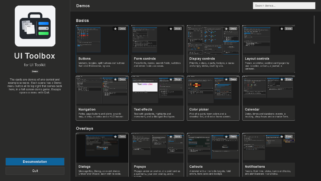
The scene Assets/UIToolbox/DemoMenu.unity is the start of the demo. The left side has the logo, the Documentation button and the Quit button. The right side has a search field and a card with a screenshot for each other sample scene.
The cards are in eight groups, under a Favorites group:
| Group | Scenes |
|---|---|
| Basics | Buttons, form controls, display controls, layout controls, navigation, text effects, the color picker and the calendar. |
| Overlays | Dialogs, popups, callouts, notifications and the radial menu. |
| Data | DataGrid, DataTree, the property grid, charts, pie charts, gauges and rings, and the timeline. |
| Windows | The workspace, tabs, window templates, GridPanel, commands and keys, animations, code and logs, and chat. |
| Game UI | The radar, input and glyphs, the tech tree, the alert strip, the item compare, UI particles, glass panels, game skins, video, and drag and drop. |
| Game examples | Screens of a game: Kingdom, Firefight, a game menu with settings, save and load, an inventory, a shop, a character sheet, a quest journal, a dialogue, a loading screen, gathering notifications, a retro PC, the Crypt dungeon crawler, the Driller mining game and a boss intro. |
| Windows and themes | The workspace and its looks: windows from UXML, Planets, Styles and Localization. |
| Data and tools | Units, Bindings and Factory. |
The search field (a SearchDropdown) shows the cards whose title, text or group has the words you type. Its list opens the scene of a pick.
Each card has a star and a Docs button over its screenshot:
- The star makes the demo a favorite. The card moves to the Favorites group at the top of the list. A second click on the star moves it back. The menu keeps the favorites in
demo-favorites.txtinApplication.persistentDataPath, so they stay after a restart. The Favorites group hides when it has no card. - Docs opens the docs screen at the page of the demo: the page of its control, or this page for the game examples.
A scene that the menu opens gets a way back:
- A sample gets a header: the logo, the toolbar buttons of the scene, and a "◀ Demo menu" button at the right. A workspace without a toolbar gets one.
- A full screen game gets no header. Kingdom, Firefight and Crypt have the button at the end of their own toolbar. Gathering has it in the bottom right corner, because its quest list is at the top right. Driller, GameMenu and Boss intro have it in the top right corner.
- In Kingdom, Firefight, Crypt, Gathering and Boss intro, Escape opens a menu with Resume and Quit to demo menu, and the game time stops while it shows. The pause menus of Driller and GameMenu go back to the demo menu, and the Retro PC room has the button on its HUD.
To run the demo in the editor:
- In the Project window, open
Assets/UIToolbox. Double-clickDemoMenu. - Press Play.
- Click a card, or type in the search field. The arrow keys or the gamepad move between the buttons and the cards, and Enter opens one.
- In the scene, click ◀ Demo menu to come back. In a full screen game, press Escape, then click Quit to demo menu.
- Click Documentation to read the documentation. Click ◀ Demo menu or press Escape to come back.
- Click Quit, then Yes, to stop. In the editor, this stops play mode. In a player, this closes the program (
SampleScreen.QuitAsync).
To run the demo as a player: click Tools > UI Toolbox > Samples > Run Demo Player. Unity builds the player into Builds/Smoke and starts it. The build blocks the editor for a few minutes.
The files are in Assets/UIToolbox/Examples/DemoMenu:
| File | Does |
|---|---|
DemoMenuController |
Builds the cards from DemoMenuController.DEMOS, runs the search, the favorites and the docs screen. |
DemoNavigation |
Open(path) loads a scene and notes that the menu opened it. Then the scene gets its header, or its back button and Escape menu (AddHeader, AddBackButton, AddEscapeMenu). A scene that you play directly gets nothing. |
DemoDocs |
Reads the table of contents, the documents and the screenshots: in the project folder in the editor, in StreamingAssets/UIToolboxDocs in a player. |
SampleMarkdown |
Shows Markdown as UI Toolkit elements: headings, paragraphs, lists, tables, code blocks, quotes, images, bold, italic, code and links. |
SampleScenes (in Assets/UIToolbox/Examples/Shared) |
LoadAsync(path, mode) loads a scene by its path in the editor and in a player. The Loading example uses it too. |
To add a demo:
- Put the scene into
Assets/UIToolbox/Examples/Scenes. - Add one line to
DemoMenuController.DEMOS: the group, the title, the scene path withoutAssets/UIToolbox/Examples/Scenes/and.unity, one sentence for the card, and the page of its documentation (a path inDocumentation, with an optional#anchor). - Save a 16:9 screenshot of the scene as
Documentation/images/screens/<SceneName>.png. A card without a screenshot shows an empty picture.
The scene needs no change: the back button comes from DemoNavigation.
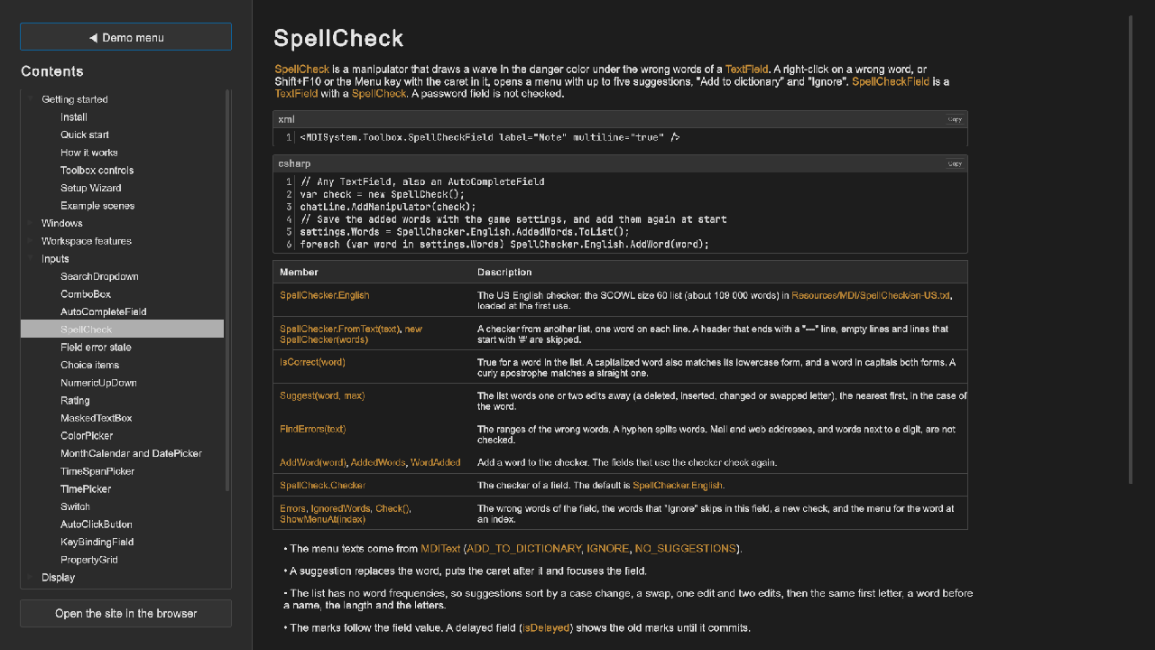
The docs screen shows the documents of Documentation/README.md, the table of contents. The left side is a DataTree: a category for each heading of the contents, with its documents below it. The right side shows the selected document. A link to another document or to a section opens it in the page, and a web link opens the browser. "Open the site in the browser" opens Documentation/site/index.html.
Tips:
- In a sample, the back button is a part of the toolbar, so a maximized or docked window does not cover it. In your own game, put such a button into your toolbar.
DemoNavigation.OpensetsTime.timeScaleto 1, so a demo that paused the game does not stop the next one.- The scenes of the demo are not in the build settings. In the editor a scene loads by its path. A player that you build with File > Build Profiles has only the scenes of its list, and a card of a missing scene shows "The scene of ... is not in the build.". Use Run Demo Player, or add the scenes to your list.
- A player reads the documents from
<player>_Data/StreamingAssets/UIToolboxDocs. Run Demo Player copies them there after the build (DemoDocs.PLAYER_COPY). The project has noAssets/StreamingAssetsfolder for them, so the documents exist one time only. SampleMarkdownis not a full Markdown parser: no HTML, no reference links, no nested lists with paragraphs. Use a parser library when your text needs more.- To show your own help in a game, call
SampleMarkdown.Render(element, lines, start, end, image, link)with the lines of your file. Each block has a class that starts withmd-;DemoMenu.ussstyles them.