

 ListItem
A ListItem is a row of a list: a picture at the left, a title with a description, and actions at the right. The whole row can be one button.
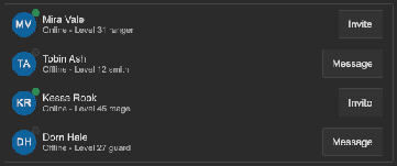
How to make rows with an avatar, with actions, and a row that the user clicks:
<tb:ListItem title="Ada Lovelace" description="Owner">
    <tb:UserAvatar display-name="Ada Lovelace" class="tb-list-item__media" />
    <ui:Button text="Remove" name="removeAda" />
</tb:ListItem>
<tb:ListItem title="Two-factor sign-in" description="Ask for a code at each sign-in." outline="true">
    <tb:Switch />
</tb:ListItem>
<tb:ListItem name="openProject" title="Open a project" description="Pick a folder on this computer." clickable="true" />
root.Q<ListItem>("openProject").Clicked += openProject;

var row = new ListItem { Title = "Report.pdf", Description = "2.4 MB", Icon = Background.FromTexture2D(fileIcon) };
row.Add(new Button(download) { text = "Download" });
list.Add(row);
| Member | Description |
|---|---|
Title (title) |
The main line. An empty title shows no line. |
Description (description) |
The muted text under the title. Rich text tags work. An empty description shows no line. |
Icon (icon) |
The small picture at the left of the title, 16 px. No picture by default. |
Outline (outline) |
Shows a border around the row. |
Clickable (clickable) |
Makes the whole row one button. False by default. |
Media |
The place at the left of the title. Add an avatar or a picture to it from code. |
Clicked |
Raised when the user clicks a clickable row, or submits it with the keyboard or a gamepad. |
- The children of the row are its actions. They go to the right end of the row.
- A child with the class
tb-list-item__mediagoes to the left of the title. The row moves this child when it attaches to a panel. - A clickable row shows the hover color, takes the focus with Tab and the arrow keys, and shows the focus border.
- Enter, Space and the submit button of a gamepad click the focused row.
- A click on an action button does not click the row.
- A long title or description wraps.
Tips:
- Use
Iconfor a small picture, and the media class for a larger element such as aUserAvatar. - Use a clickable row with no action buttons for a menu of places to go. Use a row with action buttons for a list that the user edits.
- For a list with many rows, put the rows in a
ScrollView. For hundreds of rows of data, use aListViewor aDataGrid. - Put a
Separatorbetween rows without an outline.
Styling
| Class | Element |
|---|---|
tb-list-item |
The row. It has a transparent border, so the outline and the focus border do not move the content. |
tb-list-item--outline |
Set by Outline: the border has --tb-color-border. |
tb-list-item--clickable |
Set by Clickable: --tb-color-surface-hover on hover, and a --tb-color-accent border with the focus. |
tb-list-item__media-slot |
The place at the left, with the icon and the media children. |
tb-list-item__icon |
The picture of Icon, 16 px. Hidden without an image. |
tb-list-item__body |
The column with the title and the description. It takes the free width. |
tb-list-item__title |
The title. |
tb-list-item__description |
The description in --tb-color-text-muted and the small font size. |
tb-list-item__actions |
The row of the action children at the right. |
tb-list-item__media |
Put it on a child to send the child to the left of the title. |
.tb-list-item { padding: 8px 12px; }
.tb-list-item--clickable:hover { background-color: var(--tb-color-surface-alt); }