

 InputGroup
An InputGroup puts one border around a text field and its addons: an icon, a short text such as a unit or a prefix, a Kbd, or a button.
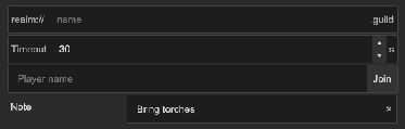
How to add an input group:
<tb:InputGroup show-clear-button="true">
    <ui:VisualElement name="searchIcon" class="tb-input-group__icon" />
    <ui:TextField placeholder-text="Search..." />
    <tb:Kbd keys="Ctrl+K" />
</tb:InputGroup>

<tb:InputGroup name="site">
    <ui:Label text="https://" />
    <ui:TextField />
    <ui:Button text="Open" name="open" />
</tb:InputGroup>
var group = new InputGroup { ShowClearButton = true };
group.Add(new TextField());
group.Add(new Label("kg"));

root.Q("searchIcon").style.backgroundImage = searchIcon;
root.Q<Button>("open").clicked += () => Application.OpenURL("https://" + root.Q<InputGroup>("site").Field.value);
| Member | Description |
|---|---|
| The children | The field and the addons. They show in a row, in their order: a child before the field is at the start, a child after it is at the end. |
ShowClearButton (show-clear-button) |
Shows a "×" button at the end while the field has text. |
Field |
The first field with a text value in the group: a TextField, a ComboBox, a SearchDropdown. Null when there is none. |
ClearText() |
Empties Field, with a change event, and gives it the focus. The clear button calls it. |
The addons:
| Child | Look |
|---|---|
A Label |
A text addon in the muted text color. |
An Image, or an element with the class tb-input-group__icon |
An icon of 16 x 16 px with the muted text color as its tint. Set the image of the element in code or in USS. |
| A Kbd | A key hint. |
A Button |
A button as high as the group, with no border of its own. |
- The group draws the border and the background. The text box in it has none.
- The border takes
--tb-color-accentwhile the field has the focus. A focused button addon shows its own focus ring. - The field takes the free width. The addons keep their own width.
- The field can be a Unity
TextFieldor a field with a text box in it: a ComboBox, a SearchDropdown or a NumericUpDown. - The clear button is not a stop for Tab or for a gamepad. A button addon is.
- The clear button follows the change events of the field. After
SetValueWithoutNotifyon the field, it shows at the next change. - A field error on the group makes its border red:
FieldError.Show(group, "...").
Tips:
- Give the field no label. The group has no label; put the group in a row with a label, or in a field wrapper.
- Use a
Labeladdon for a unit ("kg", "%") or a fixed part of the value ("https://", ".com"). The addon text is not part of the value. - A
NumericUpDownhas a number value, soFieldis null and the clear button does not show for it.
Styling
The rules are in Assets/UIToolbox/Runtime/Resources/UIToolbox/Styles/Controls.uss.
| Class | Element |
|---|---|
tb-input-group |
The group: a row with a border and --tb-color-background. |
tb-input-group--focused |
Set while the field has the focus. The border is --tb-color-accent. |
tb-input-group__content |
The row of the field and the addons. |
tb-input-group__icon |
Add it to an element that shows an icon. |
tb-input-group__clear |
The clear button. |
To make a text addon look like a separate part:
.tb-input-group > .unity-label {
    background-color: var(--tb-color-surface-alt);
}
In a selector, the field and the addons are children of tb-input-group. A selector with tb-input-group__content > in front of them does not match.