

 Alert
Alert
An Alert is a message that stays in the layout, such as a warning above a form. It has a severity, an icon, an optional title, a message, an optional close button and action buttons. For a message that floats and goes away after a time, use a notification instead.
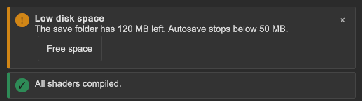
<tb:Alert name="diskAlert" severity="Warning" title="Low disk space"
          message="The save folder has 120 MB left." closable="true">
    <ui:Button text="Free space" name="freeSpace" />
</tb:Alert>
var alert = root.Q<Alert>("diskAlert");
alert.Closed += () => Debug.Log("The user closed the alert");
if (disk.FreeMegabytes > 500) alert.Close(); else alert.Open();
| Member | Description |
|---|---|
Severity (severity) |
Info (the default), Success, Warning or Error: the Severity values. It sets the icon and the class tb-alert--info, --success, --warning or --error. |
Title (title) |
The bold line above the message. An empty title shows no line. |
Message (message) |
The message. Rich text tags work. |
Closable (closable) |
Shows the "×" button. Off by default. |
Close(), Open(), IsOpen |
Hide the alert, show it again, and the state. A closed alert stays in the hierarchy. |
Closed |
Raised when Close or the close button hid the alert. |
- The children of the alert are its action buttons. They go in a row under the message.
- The tooltip of the close button is the
ToolboxText.CLOSEtext.
Tips:
- Put an alert at the top of the content that it is about, not at the top of the screen.
- Use an alert without
closablefor a state that the user must fix, such as "No connection". Close it from code when the state ends. - Keep the message to one or two sentences. Put the fix in an action button.
Styling
| Class | Element |
|---|---|
tb-alert |
The row with the icon, the body and the close button, on --tb-color-surface-alt, with a left border of 4 px. |
tb-alert--info, --success, --warning, --error |
The severity. It sets the color of the left border and of the icon: accent, success, warning or danger. |
tb-alert__icon |
The round icon label, 20 px. |
tb-alert__body |
The column with the title, the message and the actions. |
tb-alert__title, tb-alert__message |
The bold title and the message. Both wrap. |
tb-alert__actions |
The row of the child elements, which wraps. Each child has a top margin. |
tb-alert__close |
The "×" button (20 px). It shares its rules with the close button of a notification. |
To fill an error alert with the danger color:
.tb-alert--error { background-color: var(--tb-color-danger); }
.tb-alert--error .tb-alert__title, .tb-alert--error .tb-alert__message { color: var(--tb-color-danger-text); }