

 Callout
A Callout is a speech bubble: a box with a tip that points at a control. It stays open until your code, Escape or a press outside closes it. Use it for a hint, a tutorial step, a warning next to a field, or a small popover with controls. For a text that shows while the pointer is over a control, use a ToolTip. For a callout that opens on hover, use a HoverCard.
Video tutorial: Callouts. All videos: Video tutorials.
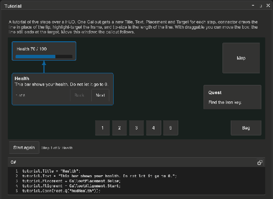
How to add a callout in UXML:
- Declare the callout in the UXML of a window. Set
targetto the name of the control that it points at. - Find the callout in code and call
OpenorTogglefrom a button.
<ui:Button name="rename" text="Rename" />
<tb:Callout name="renamePopover" target="rename" placement="Right" close-on-outside-click="true" text="Type the new name.">
    <ui:TextField label="Name" />
    <ui:Button name="ok" text="OK" />
</tb:Callout>
var popover = root.Q<Callout>("renamePopover");
root.Q<Button>("rename").clicked += () => popover.Toggle();
root.Q<Button>("ok").clicked += popover.Close;
popover.Closed += () => Debug.Log($"Name: {popover.Q<TextField>().value}");
How to make a callout in code:
var hint = new Callout { Text = "Click here to save.", Placement = CalloutPlacement.Right };
hint.Open(saveButton);
How to show a warning next to a field:
var warning = new Callout { Text = "The name is in use.", Severity = Severity.Warning };
nameField.RegisterValueChangedCallback(evt =>
{
    if (names.Contains(evt.newValue)) warning.Open(nameField);
    else warning.Close();
});
How to keep a callout at a fixed place (a tutorial text in a corner that points at one control, then at the next):
var step = new Callout { Placement = CalloutPlacement.Free, TipSize = 18, Text = "First, pick a class." };
step.style.left = 40;
step.style.top = 170;
step.style.width = 220;
step.Open(classDropdown);
// The box stays. The tip turns to the new target.
nextButton.clicked += () => { step.Text = "Then type a name."; step.Target = nameField; };
Tutorial hint: a callout that the user can move, with a line to the control and a frame around it:
<ui:Button name="continue" text="Continue" />
<tb:Callout name="tutorial" target="continue" placement="Free" style="left: 40px; top: 170px;"
            title="Step 1" text="Click the button to continue."
            connector="true" highlight-target="true" draggable="true" />
var tutorial = root.Q<Callout>("tutorial");
tutorial.Open();
root.Q<Button>("continue").clicked += tutorial.Close;

// The same callout in code
var hint = new Callout { Placement = CalloutPlacement.Free, Title = "Step 1", Text = "Click the button to continue." };
hint.Connector = true;
hint.HighlightTarget = true;
hint.Draggable = true; // the user can move the hint off the controls that it covers
hint.style.left = 40;
hint.style.top = 170;
hint.Open(continueButton);
How to point one callout at several elements:
// The box is next to the first element. The other two get a line from the box and a frame.
var step = new Callout { Title = "Edit the label", Text = "Select the series, then change its Label.", HighlightTarget = true };
step.Open(labelField, seriesRow, chart);
How to give a callout the look of a speech bubble or a thought bubble:
<tb:Callout target="npc" look="Talk" placement="Above" tip-size="18" text="Hello, traveler!" />
<tb:Callout target="hero" look="Thought" placement="Above" tip-size="28" text="I need a key." />
Talk gives the box round corners and a curved tail in place of the tip. Thought draws a cloud around the box and a tail of three circles that get smaller toward the target. The two looks use the background and the border of the box.
How to point a callout at an object of the 3D scene:
// A tag that follows an enemy on the screen, with lock-on brackets around it
var tag = new Callout { Title = "TARGET", Text = "Orc", TargetBox = CalloutTargetBox.Brackets, ClampToEdge = true };
tag.TargetRenderer(enemy.GetComponent<Renderer>());
tag.Open(hudRoot);

// A speech bubble over the head of an NPC
var talk = new Callout { Text = "Hello!", Look = CalloutLook.Talk, Placement = CalloutPlacement.Above };
talk.TargetWorld(npc.transform.Find("Head"));
talk.Open(hudRoot);

// A label at a point of the world
var label = new Callout { Text = "Exit", Connector = true, TipSize = 40 };
label.TargetWorldPosition(new Vector3(12, 3, 40));
label.Open(hudRoot);
The callout calculates the screen position of the target each frame. The element that you give to Open sets the workspace (or the panel) that the callout shows over. A callout declared in UXML can use Open() with no element.
When a camera draws into a render texture that an element shows, give the camera and that element:
tag.TargetRenderer(enemy.GetComponent<Renderer>(), minimapCamera, minimapView);
tag.Open();
The callout then maps the view of the camera to the element, and the edges of the element are the edges of the screen.
| Member | Description |
|---|---|
Title (title) |
A bold first line above the text. Empty (the default) shows no title. |
Text (text) |
A text under the title and above the content. Empty (the default) shows no text. |
TargetName (target) |
The name of the target element. The callout finds the first match under its nearest ancestor that has one. Open() uses it when no target is set. |
Target |
The element that the tip points at. An open callout moves to a new target. A new element removes the 3D target. |
MoreTargets |
More elements that the callout points at, after Target. Each one that shows gets a line from the nearest edge of the box, in the style of Connector, and with HighlightTarget a frame. The box stays next to Target. Empty by default. |
TargetWorld(transform, camera, viewport) |
Points the callout at the position of a Transform, each frame. camera is null by default: the callout uses Camera.main. viewport is the element that shows the render texture of the camera, or null when the camera draws on the screen. |
TargetWorldPosition(position, camera, viewport) |
Points the callout at a fixed point of the world. |
TargetRenderer(renderer, camera, viewport), TargetCollider(collider, camera, viewport) |
Points the callout at the rectangle around the 8 corners of Renderer.bounds or Collider.bounds on the screen. TargetBox draws around this rectangle. |
HasWorldTarget |
True when the target is in the 3D scene. |
TargetInView |
True when the target is on the screen, or in the viewport. False when it is behind the camera or off the screen. |
ClampToEdge (clamp-to-edge) |
For a 3D target out of view: true keeps the callout at the edge of the screen, with its tip in the direction of the target. False (the default) hides the callout until the target is in view again. |
TargetBox (target-box) |
None (the default), Box or Brackets. Draws a rectangle or four corner brackets around the target, for an element or a 3D target. The mark comes in with a short animation, and the tip ends on it. |
Look (look) |
Default, Talk (a speech bubble) or Thought (a thought bubble). It sets the class tb-callout--talk or tb-callout--thought. |
Placement (placement) |
Below (the default), Above, Right, Left or Free. A side flips to the opposite side when the workspace has no room. Free keeps the left and top of the callout style. |
Alignment (alignment) |
The place of the callout along the side of the target: Start, Center (the default) or End. Start puts the left edges in one line, or the top edges for a callout on the right or the left. End does the same for the right or the bottom edges. It has no effect with Free. |
TipSize (tip-size) |
The length of the tip in pixels, and the space between the callout and its target. 10 by default. 0 shows no tip. |
Connector (connector) |
Draws a straight line from the edge of the callout to the nearest edge of the target. The line replaces the tip. Off by default. |
HighlightTarget (highlight-target) |
Shows a frame around the target while the callout is open. The user can click the target through the frame. Off by default. |
Draggable (draggable) |
The user can drag the callout by its box. It stays where the user puts it until the next Open. Off by default. |
Severity (severity) |
Info (the default), Success, Warning or Error. It sets the class tb-callout--{severity}: the color of the border and the tip. |
CloseOnOutsideClick (close-on-outside-click) |
A press outside the callout and its target closes it. Off by default. |
Open(target) |
Shows the callout next to target, or next to Target or the element with the name TargetName. An open callout only moves to the new target. |
Open(target, moreTargets...) |
Sets MoreTargets, then opens next to target. |
Close(), Toggle(target) |
Hides the callout, or changes the state. |
Side |
The side that the callout is on now, after a flip. Free after the user dragged it. |
IsOpen, Opened, Closed |
The state and its events. Closed is raised when the close starts, before the exit animation ends. |
- The callout follows its target. When the user moves the window of the target, the callout moves with it.
- The tip slides along the edge of the box and turns to the center of the target. It has the background and the border of the box.
- The connector line and the frame follow the target and the callout. They hide while the target does not show, for example in a tab that is not selected, and they go away when the callout closes.
- The lines to
MoreTargetsshow also whenConnectoris off, because the tip points at one target only. A line hides while its target does not show or the box covers it. - The connector line starts at the point of the box edge that is nearest to the target, and ends on the edge of the target, not at its center.
- A drag starts after the pointer moves 4 px, so a click in the callout is still a click. A press on a control in the callout, such as a button or a text field, does not start a drag.
- A callout that the user dragged stays inside the workspace and does not go back to its target when the target moves. Its tip or its line still points at the target.
CloseandOpenput it back at its declared placement. - A callout is not modal. The user can work with the windows while it is open, and the workspace shortcuts work.
- A callout with controls gives the focus to its first control. A callout with only text leaves the focus where it is.
- Escape closes the callout that has the focus. A callout closes when its target leaves the panel, for example when its window closes.
- A callout declared in UXML stays hidden until
Open. It moves to the workspace while it is open, then goes back to its place. - The callout takes the classes of the nearest
tb-style-scopeabove its UXML place, or above the target, as aMessageBoxdoes. - A 3D target moves with the frames of the game, so the callout calculates its place on each update of the panel. It does not allocate memory for this.
- A callout closes when its 3D object is destroyed. It hides while the object is not active, the renderer or the collider is off, or the viewport does not show.
- For a 3D target that is out of view, the callout gets the class
tb-callout--out-of-view. Behind the camera, a clamped callout goes to the edge on the side that is the short turn to the target. - The callout uses no editor API. It works in a built player.
Tips:
- Use one callout for a tutorial and change its
TextandTargetfor each step. The user sees one bubble that moves. - Give a popover
close-on-outside-click="true". Leave it off for a hint that must stay while the user works. - Use
Toggleon the button that opens the callout, so a second click closes it. A press on the target does not count as a press outside. - Keep the text short. The box is 320 px wide at most; change
max-widthon.tb-calloutfor a wider one. - A
Freecallout withtip-size="0"is a plain floating note. - Use
alignment="Start"for a popover under a wide control, such as a search field, so the popover starts at the left edge of the control. - Make a tutorial hint
draggable, so the user can move it off the controls that it covers. - A callout has no cursor for the drag. Tell the user in the text when the drag is important.
- Give a
Thoughtcallout atip-sizeof 24 or more. The cloud uses 10 px of the tip, and the three circles need the rest. - Use
ClampToEdgefor a quest marker or an enemy tag, so the player sees where to turn. Leave it off for a label that is only useful on the screen. - Use
TargetRendererfor a lock-on.TargetWorldpoints at the pivot of the object, which is often at its feet. - An MDI window has an opaque background. To show a 3D target in a window, let a camera draw into a render texture and show it in an element. The CalloutDemo example does this in its 3D target tab.
Styling
| Class | Element |
|---|---|
tb-callout |
The box: position: absolute, 320 px wide at most, on --tb-color-surface-alt, with a border in --tb-color-accent and --tb-radius-md. The tip has the background color and the top border color and width of the box. |
tb-callout--info, --success, --warning, --error |
The severity. It sets the border color. Info keeps the accent; error uses --tb-color-danger. |
tb-callout__title |
The bold Label of Title, the first line. |
tb-callout__text |
The Label of Text, above the content. |
tb-callout__connector |
The element that draws the connector line. It is next to the callout in the workspace, under the box, and takes no pointer event. |
tb-callout__highlight |
The frame around the target: a 2 px border with --tb-radius-md. It is next to the callout in the workspace and takes no pointer event. The callout gives it the color of the connector. |
tb-callout__target-box |
The element that draws the box or the brackets of TargetBox. It covers the workspace, under the callout, and takes no pointer event. |
tb-callout--talk |
The Talk look: radius 18 px and more padding at the sides. |
tb-callout--thought |
The Thought look: more padding at the sides and a small radius. The cloud goes 10 px past the box. |
tb-callout--out-of-view |
A 3D target that is out of view: opacity 0.75 for a callout at the edge. |
tb-callout--hidden |
Opacity 0 and scale 0.8: the start of the enter animation and the end of the exit. |
tb-callout--anim-in, --anim-out |
The transitions of opacity and scale, with --tb-animation-duration-fast. |
Set these USS variables on the callout to style the connector line and the target box:
| Variable | Description |
|---|---|
--tb-callout-connector-color |
The color of the line and the frame. The default is the border color of the callout. |
--tb-callout-connector-width |
The width of the line in pixels. 2 by default. |
--tb-callout-connector-cap |
The end of the line at the target: "dot" or "arrow". No cap by default. |
--tb-callout-box-color |
The color of the box or the brackets of TargetBox. The default is the color of the connector. |
--tb-callout-box-width |
The width of the box lines in pixels. 2 by default. |
--tb-callout-box-padding |
The space between the target and the box in pixels. 6 by default. |
--tb-callout-box-corner |
The length of each line of a bracket in pixels. 14 by default. |
.enemy-tag {
    --tb-callout-box-color: rgb(255, 196, 0);
    --tb-callout-box-width: 3;
    --tb-callout-box-corner: 20;
}
.tb-callout {
    --tb-callout-connector-color: var(--tb-color-warning);
    --tb-callout-connector-width: 3;
    --tb-callout-connector-cap: "arrow";
}
.tb-callout__highlight { border-width: 3px; border-radius: 0; }
To make every callout a yellow note with a thick border:
.tb-callout {
    background-color: #fff3b0;
    border-color: #c9a400;
    border-width: 2px;
    border-radius: 2px;
}
.tb-callout__text { color: #3b2f1e; }
Use an opaque background. The tip is drawn over the border of the box, and a transparent background shows the overlap.