

 Card
Card
A Card is a container with a border: a header with a title, a description and an action at the right, then the content, then a footer.
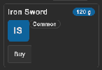
How to make a card with a header action and a footer:
<tb:Card title="Plan" description="Your plan renews on the first day of each month.">
    <ui:Button text="Change" class="tb-card__action" />
    <ui:Label text="Pro, 5 seats" />
    <ui:Label text="12 GB of 50 GB used" />
    <ui:Button text="Cancel the plan" class="tb-card__footer" />
    <ui:Button text="Add seats" class="tb-card__footer" />
</tb:Card>
var card = new Card { Title = "Plan", Description = "Your plan renews on the first day of each month." };
card.Add(new Label("Pro, 5 seats"));
card.Action.Add(new Button(changePlan) { text = "Change" });
card.Footer.Add(new Button(addSeats) { text = "Add seats" });
| Member | Description |
|---|---|
Title (title) |
The bold line of the header. An empty title shows no line. |
Description (description) |
The muted text under the title. Rich text tags work. An empty description shows no line. |
Action |
The place at the right of the header. Add the header buttons to it from code. |
Footer |
The row under the content. Add the footer buttons to it from code. |
- The children of the card are its content.
- A child with the class
tb-card__actiongoes into the header, at the right of the title. A child with the classtb-card__footergoes into the footer. The card moves these children when it attaches to a panel. - The header shows only when the card has a title, a description or an action. An empty footer takes no room.
- A long title or description wraps.
Tips:
- Use a card for one subject: a plan, a user, a save game. For a list of rows of the same kind, use
ListItem. - Put the main button of the card in the footer, and a small button such as "Edit" in the header.
- For a card with only an action in the header that code adds later, also set a title. The card looks for the action when it attaches.
- Put cards in a
GridPanelfor a dashboard.
Styling
| Class | Element |
|---|---|
tb-card |
The card: a --tb-color-surface background, a --tb-color-border border, --tb-radius-md corners and --tb-spacing-md padding. |
tb-card__header |
The row with the texts and the action. Hidden when it has no content. |
tb-card__headings |
The column with the title and the description. |
tb-card__title |
The bold title in the large font size. |
tb-card__description |
The description in --tb-color-text-muted. |
tb-card__action-slot |
The row at the right of the header. |
tb-card__content |
The parent of the content children. |
tb-card__footer-slot |
The row under the content. |
tb-card__action |
Put it on a child to send the child to the header. |
tb-card__footer |
Put it on a child to send the child to the footer. |
.tb-card { padding: 16px; background-color: var(--tb-color-surface-alt); }
.tb-card__footer-slot { justify-content: flex-end; }