

 CodeBlock
A CodeBlock shows source code, or other text where the spaces matter. It uses a monospace font and keeps the indentation. It has line numbers, a title and a button that copies the code to the clipboard. Use it for a console command in a help screen, for a mod script, or for a save code that the player shares.
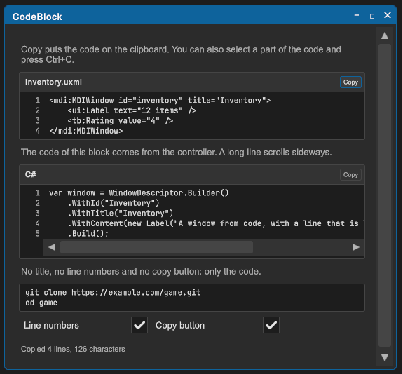
<tb:CodeBlock title="Inventory.uxml" code="<ui:Label text="12 items" /> <tb:Rating value="4" />" />
var block = new CodeBlock { Title = "C#", Language = CodeLanguage.CSharp, Code = "if (ready)\n\tstart();" };
block.Copied += code => Debug.Log($"Copied {code.Length} characters");
panel.Add(block);
| Member | Description |
|---|---|
Code (code) |
The code. A line end is \n; the control also reads \r\n. A tab shows as four spaces. The clipboard gets the code with its tabs. |
Language (language) |
The language of the code: None, CSharp, Uxml, Uss or Json. The words of the language get colors. None by default: the code has one color. See Syntax colors. |
Title (title) |
The text above the code, such as a file name or a language. An empty title shows no text. |
ShowLineNumbers (show-line-numbers) |
Shows the number of each line to the left of the code. On by default. |
ShowCopyButton (show-copy-button) |
Shows the copy button. On by default. |
LineCount |
The number of lines of the code. |
Copy() |
Puts the code on the system clipboard, raises Copied and shows a check mark on the button for two seconds. |
Copied |
The event after a copy. The argument is the code. |
- A line that is wider than the block does not wrap. The code scrolls sideways.
- The user can select a part of the code with the pointer and copy it with Ctrl+C.
- A block with no title and no copy button has no header.
- With no
Language, the control shows the code in one color.
Tips:
- In UXML, write a line end as
, a<as<and a"as". For more than a few lines, setCodefrom the controller. A text file of the project gives the code withtextAsset.text. - The block is as high as its lines. For long code, put the block in a
ScrollViewwith a fixed height. - The copy button shows a copy icon, and a check mark after a copy. Its tooltip is "Copy" or "Copied".
- The texts "Copy" and "Copied" are the
ToolboxTextkeystb.copyandtb.copied. See Localization. - For a different font, set
-unity-font-definitionon.tb-code-block__numbersand.tb-code-block__text. Use a monospace font, and the same font for the two, so the numbers stay in line with the code.
Syntax colors
Set Language and the control gives a color to each part of the code that it knows. The code itself does not change: Code, Copy() and Copied give the code with no colors, and the line numbers stay the same.
<tb:CodeBlock title="Player.cs" language="CSharp" code="var lives = 3; // at the start" />
block.Language = CodeLanguage.Json;
| Language | The parts with a color |
|---|---|
None |
No part. This is the default. |
CSharp |
Keywords, strings, characters, numbers, comments, and the type name after new, class, struct, enum, interface or record. |
Uxml |
Element names with their brackets, attribute names, attribute values and comments. Use it for other XML too. |
Uss |
Selectors, property names, numbers with their unit, colors such as #ff8800, strings, variables (--name) in a value, and comments. |
Json |
Keys, strings, numbers, and true, false, null. |
Each color is a custom property on the block. Set it on .tb-code-block, or on your own class of a block.
| Property | The part | Dark block | Light block |
|---|---|---|---|
--tb-code-keyword |
A keyword. In JSON: true, false, null. |
#569CD6 |
#0000FF |
--tb-code-type |
A type name in C#. A variable in a USS value. | #4EC9B0 |
#267F99 |
--tb-code-string |
A string, a character, the value of a UXML attribute. | #CE9178 |
#A31515 |
--tb-code-comment |
A comment. | --tb-color-text-muted |
--tb-color-text-muted |
--tb-code-number |
A number. In USS also a color such as #ff8800. |
#B5CEA8 |
#098658 |
--tb-code-tag |
A UXML element name. A USS selector. | #569CD6 |
#800000 |
--tb-code-attribute |
A UXML attribute name, a USS property name, a JSON key. | #9CDCFE |
#E50000 |
The control has two sets of default colors. It takes the set for a dark block when the background color of the block is dark, and the set for a light block when it is light. So the colors follow the theme. A property that you set replaces the default in the two sets.
.my-code {
    background-color: rgb(40, 42, 54);
    --tb-code-keyword: rgb(255, 121, 198);
    --tb-code-string: rgb(241, 250, 140);
    --tb-code-comment: rgb(98, 114, 164);
}
.my-code .tb-code-block__text { color: rgb(248, 248, 242); }
The words with no color of their own have the color of .tb-code-block__text.
Limits:
- The control reads the words of the code. It does not read their meaning. So the name of a class, a method or a field has the text color, but for a type name after
neworclass. - There are four languages. You cannot add a language.
- Code of more than 20 000 characters shows in one color.
- A block with a transparent background takes the colors for a dark block. On a light panel, give the block a background color or set the properties.
Styling
| Class | Element |
|---|---|
tb-code-block |
The block: --tb-color-background, a border and a radius. |
tb-code-block__header |
The row with the title and the copy button, in --tb-color-surface-alt. |
tb-code-block__title |
The title, bold and small, in --tb-color-text-muted. |
tb-code-block__copy |
The copy button. |
tb-code-block__copy--done |
The copy button for two seconds after a copy, in --tb-color-success. |
tb-code-block__copy-icon |
The icon in the copy button, 14 px. The control draws it in the color of the button. A background-image replaces the drawn icon. |
tb-code-block__copy-text |
The text "Copy" or "Copied" in the copy button. It is off (display: none). |
tb-code-block__body |
The row with the line numbers and the code. |
tb-code-block__numbers |
The line numbers, in --tb-color-text-muted, with a border on the right. |
tb-code-block__scroll |
The horizontal ScrollView of the code. |
tb-code-block__text |
The code: JetBrains Mono, small, white-space: pre. |
.tb-code-block { background-color: #101418; border-color: var(--tb-color-accent); }
.tb-code-block__text { color: #9be29b; }
The copy button
The color of the icon is the color of the button:
.tb-code-block .tb-code-block__copy { color: var(--tb-color-accent); }
For your own icon, set an image. Set one for the state after a copy too:
.tb-code-block__copy-icon {
    background-image: url("Icons/clipboard.png");
    -unity-background-image-tint-color: var(--tb-color-text-muted);
}
.tb-code-block__copy--done .tb-code-block__copy-icon {
    background-image: url("Icons/check.png");
    -unity-background-image-tint-color: var(--tb-color-success);
}
For the text and no icon:
.tb-code-block .tb-code-block__copy-text { display: flex; }
.tb-code-block__copy-icon { display: none; }
Leave the icon on to show the icon and the text together.