

 Dialog
A Dialog is a modal dialog with your content: a title, a description, any controls and a footer with buttons. Use it for a form, a settings page or a choice that needs more than a message. For a message with standard buttons, use a MessageBox.
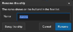
How to add a dialog in UXML:
- Declare the dialog in the UXML of a window or of the workspace. Put its content in it as child elements.
- Put the footer buttons in a child element with the class
tb-dialog__footer. Give each button aname: the name is the result of the dialog. - Find the dialog in code and call
ShowAsyncfrom a button.
<tb:Dialog name="renameDialog" title="Rename" description="Type the new name of the layout.">
    <ui:TextField name="layoutName" label="Name" />
    <ui:VisualElement class="tb-dialog__footer">
        <ui:Button name="cancel" text="Cancel" />
        <ui:Button name="rename" text="Rename" class="tb-dialog__button--default" />
    </ui:VisualElement>
</tb:Dialog>
var dialog = root.Q<Dialog>("renameDialog");
root.Q<Button>("showRename").clicked += async () =>
{
    if (await dialog.ShowAsync() == "rename") Rename(dialog.Q<TextField>("layoutName").value);
};
How to make a dialog in code:
var dialog = new Dialog { Title = "Rename", Description = "Type the new name of the layout." };
var name = new TextField("Name");
dialog.Add(name);
dialog.AddButton("Cancel", "cancel");
dialog.AddButton("Rename", "rename").AddToClassList(Dialog.DEFAULT_BUTTON_CLASS);
if (await dialog.ShowAsync(workspace) == "rename") Rename(name.value);
| Member | Description |
|---|---|
Title (title) |
The title text. The header hides when the title is empty and Closable is false. |
Description (description) |
A text under the title that tells what the dialog is for. Empty (the default) shows no text. |
CloseOnEscape (close-on-escape) |
Escape and the gamepad cancel button close the dialog. On by default. |
CloseOnOutsideClick (close-on-outside-click) |
A click on the dim overlay closes the dialog. On by default. |
Closable (closable) |
Shows the "×" button in the header. On by default. |
Glass (glass) |
The panel is frosted glass: it blurs the windows behind it and has the glass tint of the theme (--tb-color-glass-dialog). Off by default. |
GlassOverlay (glass-overlay) |
The overlay is frosted glass: it blurs the whole workspace behind the panel. Use it alone, or with Glass for a frosted panel too. Off by default. |
Footer |
The row under the content. Add any control. A Button in it with a name closes the dialog with that name as the result. The footer hides while it is empty. |
AddButton(text, result) |
Adds a footer button that closes the dialog with result. It returns the button. |
ShowAsync(anchor) |
Shows the dialog over the workspace of anchor, or over its document. A dialog in the hierarchy needs no anchor. The task completes when the dialog closes, with the result. |
Close(result) |
Closes the dialog from code. The default result is Dialog.DISMISSED. |
IsOpen, Opened, Closed |
The state and its events. Closed has the result. |
Dialog.DISMISSED |
The result of Escape, the close button and a click on the overlay: an empty string. |
- The first control of the content gets the focus. When the content has no control, the first footer button gets it.
- Tab and the arrow keys stay in the dialog. The workspace shortcuts do nothing while it is open.
- The content scrolls when it is higher than the room. The header and the footer stay in view.
- A dialog can open a dialog. The new one shows above the first one. When it closes, the focus goes back to the control that opened it.
- A footer button with no name does not close the dialog. Use it for an action such as "Apply".
- The task completes when the close starts, before the exit animation ends. If other code removes the dialog, the task completes with
Dialog.DISMISSED. - A dialog declared in UXML stays hidden until
ShowAsync. It moves to the workspace while it shows, then goes back to its place. - The dialog takes the classes of the nearest
tb-style-scopeabove its UXML place, or above the anchor, as aMessageBoxdoes.
Tips:
- Turn off
CloseOnEscape,CloseOnOutsideClickandClosablefor a dialog that the user must answer with a footer button. - Add the class
tb-dialog__button--defaultto the button of the main action. It gets the accent color. - Give
ShowAsyncthe button that opens the dialog as the anchor. The dialog covers the workspace of that button. - An Escape in a
TextFieldof the dialog first cancels the edit of that field. The next Escape closes the dialog.
Styling
| Class | Element |
|---|---|
tb-dialog |
The overlay. It fills the workspace and uses --tb-color-overlay. |
tb-dialog__panel |
The dialog panel: 320 px wide at least, 90% of the workspace at most, on --tb-color-surface. |
tb-dialog__header |
The row with the title and the close button, on --tb-color-surface-alt. |
tb-dialog__title, tb-dialog__close |
The bold title, and the "×" button (20 px). |
tb-dialog__description |
The text under the header, in --tb-color-text-muted. |
tb-dialog__body, tb-dialog__content |
The ScrollView of the content, and the element in it that holds your controls, with --tb-spacing-md padding. |
tb-dialog__footer |
The row of the buttons, aligned to the right. |
tb-dialog__button |
A footer button. tb-dialog__button--default gives it the accent color. |
tb-dialog--hidden |
Opacity 0 and the panel at scale 0.92: the start of the enter animation and the end of the exit. |
tb-dialog--anim-in, --anim-out |
The transitions on the overlay and the panel, with --tb-animation-duration-fast and the entrance or exit easing. |
tb-dialog--glass, tb-dialog--glass-overlay |
The overlay of a dialog with Glass or GlassOverlay. |
tb-modal |
Also on the overlay while the dialog is open. |
To make every dialog wider, with the buttons on the left:
.tb-dialog__panel { min-width: 480px; }
.tb-dialog__footer { justify-content: flex-start; }