

 Drawer
A Drawer is a panel that slides in from an edge of the workspace. Use it for a menu, a filter list, an inspector or a detail view that the user opens and closes. A drawer on the Bottom or Top side is a sheet. The panel has a title, a description, a close button, your content and a footer. With a handle, the user drags the drawer to change its size or to close it.
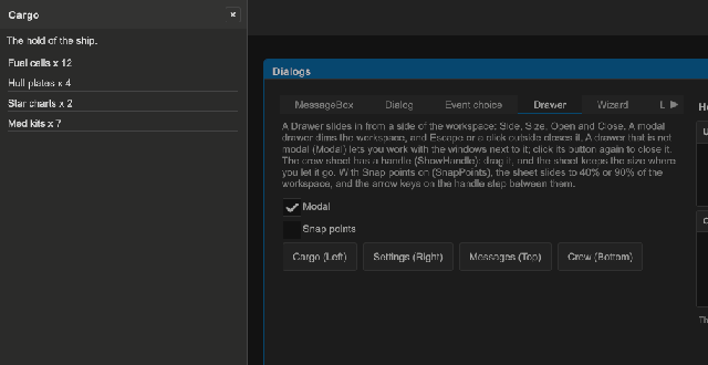
How to add a drawer in UXML:
- Declare the drawer in the UXML of a window or of the workspace. Put its content in it as child elements.
- Put the footer controls in a child element with the class
tb-drawer__footer. - Find the drawer in code and call
Openfrom a button.
<tb:Drawer name="filters" title="Filters" description="Pick what the list shows." side="Right" size="280">
    <ui:Toggle label="Only favorites" />
    <ui:TextField label="Name" />
    <ui:VisualElement class="tb-drawer__footer">
        <ui:Button name="apply" text="Apply" />
    </ui:VisualElement>
</tb:Drawer>
var drawer = root.Q<Drawer>("filters");
root.Q<Button>("showFilters").clicked += () => drawer.Open();
root.Q<Button>("apply").clicked += drawer.Close;
drawer.Closed += () => Debug.Log("Filters closed");
How to make a drawer in code:
var drawer = new Drawer { Title = "Inventory", Side = DrawerSide.Bottom };
drawer.Add(new Label("12 items"));
drawer.Open(workspace); // the anchor: the workspace, or an element in it
How to make a bottom sheet that the user drags between half and full height:
<tb:Drawer name="inventory" title="Inventory" side="Bottom" show-handle="true" snap-points="0.5,1" />
var sheet = new Drawer { Title = "Inventory", Side = DrawerSide.Bottom, ShowHandle = true };
sheet.SnapPoints = new List<float> { 0.5f, 1f };
sheet.Footer.Add(new Button(sheet.Close) { text = "Done" });
sheet.Open(workspace);
sheet.SnapIndex = 1; // full height
| Member | Description |
|---|---|
Title (title) |
The title text. The header hides when the title is empty and Closable is false. |
Description (description) |
A text under the header that tells what the drawer is for. Empty (the default) shows no text. |
Side (side) |
Left (the default), Right, Top or Bottom. It sets the class tb-drawer--left, --right, --top or --bottom. |
Size (size) |
The width of a left or right drawer, or the height of a top or bottom one, in pixels. 0 (the default) uses the USS size: 320 px wide, or 40% high. SnapPoints replace it. A drag of the handle with no snap points sets it. |
ShowHandle (show-handle) |
Shows the drag handle on the inner edge of the panel. The user drags the handle or the header to change the size or to close the drawer. Off by default. |
SnapPoints (snap-points) |
The sizes that the drawer stops at, as parts of the workspace size from small to large, for example 0.5,1. Empty (the default): the user drags the drawer to any size. |
SnapIndex (snap-index) |
The snap point that the drawer is at. Open uses it for the first size. 0 by default. |
Footer |
The row under the content. Add any control. It stays at the end of the panel, and hides while it is empty. Fill it before Open. |
Modal (modal) |
True (the default): a dim overlay takes the pointer and the keys. False: only the panel takes them. |
CloseOnOutsideClick (close-on-outside-click) |
A press on the dim overlay closes a modal drawer. On by default. |
Closable (closable) |
Shows the "×" button in the header. On by default. |
Open(anchor) |
Slides the drawer in over the workspace of anchor, or over its document. A drawer in the hierarchy needs no anchor. The first control of the content gets the focus. |
Close(), Toggle(anchor) |
Slides the drawer out, or changes the state. |
IsOpen, Opened, Closed |
The state and its events. Closed is raised when the close starts, before the exit animation ends. |
Panel |
The element that slides: the header, the description, the content and the footer. |
- Escape, the gamepad cancel button, the close button and a press outside close a modal drawer.
- With
ShowHandle, a drag on the handle or the header moves the edge of the panel. On release, the drawer slides to the nearest snap point in a short animation. With no snap points, it keeps the size where you let it go, andSizegets that size. - With no snap points, a drag goes from a quarter of the workspace (or the size at the press, when that is smaller) up to the full workspace.
- A drag that leaves less than half of the smallest size closes the drawer.
- With two or more snap points, the handle takes the focus. The arrow keys and the gamepad stick go to the next snap point: away from the edge of the drawer makes it larger.
- A drawer can open a drawer. The new one shows above the first one. Escape closes the top one, and the focus goes back to the control that opened it.
- Tab and the arrow keys stay in a modal drawer. The workspace shortcuts do nothing while it is open.
- A drawer with
Modalfalse lets the user work with the windows next to it. Give it a close button, or close it from your code, because a press outside does not close it. - A drawer declared in UXML stays hidden until
Open. It moves to the workspace while it is open, then goes back to its place. - The drawer takes the classes of the nearest
tb-style-scopeabove its UXML place, or above the anchor, as aMessageBoxdoes. - The drawer slides when the workspace has
AnimationsEnabled. Without animations it shows and hides at once.
Tips:
- Use
Sizefor a side menu that must fit long labels. Use the USS rule.tb-drawer__panelto set the size of every drawer in a theme. - A bottom sheet with
size="200"is a good place for a touch keyboard hint, a share list or the detail of a selected item. - Use
snap-points="0.5,1"withshow-handle="true"for a sheet that opens at half height and that the user pulls to full height. - A drawer without
ShowHandledoes not move with a drag. Keep the close button, so a pointer user has a way to close a drawer that is not modal. - The drawer covers the workspace of the anchor, not the whole screen. For a drawer over the whole screen, give
Openan anchor that is outside a workspace, such as the root of the document. - An Escape in a
TextFieldof the drawer first cancels the edit of that field. The next Escape closes the drawer.
Styling
| Class | Element |
|---|---|
tb-drawer |
The overlay. It fills the workspace and uses --tb-color-overlay. |
tb-drawer--left, --right, --top, --bottom |
The side. It sets the flex direction of the overlay and the border of the panel. |
tb-drawer--non-modal |
A drawer with Modal false. The overlay is transparent and lets the pointer through. |
tb-drawer__panel |
The panel that slides. 320 px wide for left and right; 40% high for top and bottom. Size sets an inline width or height. |
tb-drawer__header |
The row with the title and the close button, on --tb-color-surface-alt. |
tb-drawer__title, tb-drawer__close |
The bold title, and the "×" button (20 px). |
tb-drawer__description |
The text under the header, in --tb-color-text-muted. |
tb-drawer__body |
The content, with --tb-spacing-md padding. |
tb-drawer__footer |
The row under the content, aligned to the right. Also the class of the UXML child whose controls go into the footer. |
tb-drawer__handle, tb-drawer__handle-bar |
The area that takes the drag on the inner edge of the panel, and the small bar in it. |
tb-drawer--with-handle |
A drawer with ShowHandle. A left or right panel gets 12 px of padding for the handle. |
tb-drawer--hidden |
Opacity 0 and the panel moved out of its edge with translate: the start of the enter animation and the end of the exit. |
tb-drawer--anim-in, --anim-out |
The transitions of opacity and translate on the overlay and the panel, with --tb-animation-duration-fast and the entrance or exit easing. |
tb-modal |
Also on the overlay, only while a modal drawer is open. |
To make every drawer wider and slower:
.tb-drawer__panel { width: 420px; }
.tb-drawer--anim-in, .tb-drawer--anim-in > .tb-drawer__panel { transition-duration: 400ms; }