

 EmptyState
An EmptyState is the content of a list or a panel that has nothing to show: an icon, a title, a message and action buttons, in the center. It tells the user why the place is empty and what to do next.
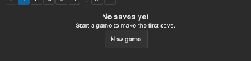
How to show an empty state for a list:
<ui:ListView name="saves" />
<tb:EmptyState name="noSaves" title="No saves yet" message="Start a game to make the first save.">
    <ui:Button text="New game" name="newGame" />
</tb:EmptyState>
void refresh()
{
    var empty = saves.Count == 0;
    root.Q("noSaves").style.display = empty ? DisplayStyle.Flex : DisplayStyle.None;
    root.Q("saves").style.display = empty ? DisplayStyle.None : DisplayStyle.Flex;
}
| Member | Description |
|---|---|
Icon (icon) |
The picture above the title, 48 px: a texture, a sprite, a render texture or a vector image. No picture by default. The USS tint is the muted text color, so a white image works best. |
Title (title) |
The bold line. An empty title shows no line. |
Message (message) |
The text under the title. Rich text tags work. An empty message shows no line. |
- The children of the control are its action buttons. They go in a row under the message.
- The control grows to fill its parent and puts its content in the center.
Tips:
- Write a title that says what is missing, and a message that says how to add it. "No saves yet" is better than "Empty".
- Use a different text for a search without results: "No results for 'xyz'", with a "Clear the search" button.
- While the data loads, show a
Skeleton, not the empty state. Show the empty state only after the load found nothing.
Styling
| Class | Element |
|---|---|
tb-empty-state |
The control. It grows, and puts its content in the center with --tb-spacing-lg padding. |
tb-empty-state__icon |
The picture, 48 px, with a --tb-color-text-muted tint. Hidden without an image. |
tb-empty-state__title |
The bold title in the large font size, 320 px wide at most. |
tb-empty-state__message |
The message in --tb-color-text-muted, 320 px wide at most. |
tb-empty-state__actions |
The centered row of the child elements. |
.tb-empty-state__icon { width: 96px; height: 96px; -unity-background-image-tint-color: var(--tb-color-accent); }