

 FormField
A FormField is a wrapper for one input of a form. It shows a label, the input, a description under the input, and an error text. It works with each Unity field and each toolbox field.
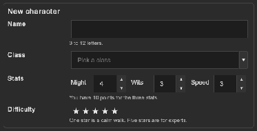
How to make a form with a description, an error and a group of fields:
<tb:FormField name="userName" label="User name" description="Other players see this name.">
    <ui:TextField />
</tb:FormField>
<tb:FormField label="Music" description="The volume of the music." horizontal="true">
    <ui:Slider low-value="0" high-value="100" />
</tb:FormField>

<ui:GroupBox text="Notifications" class="tb-field-set">
    <tb:FormField description="Send a mail when a build fails.">
        <ui:Toggle text="Build mails" />
    </tb:FormField>
    <tb:FormField description="Show a message when a friend comes online.">
        <tb:Switch label="Friends" />
    </tb:FormField>
</ui:GroupBox>
var userName = root.Q<FormField>("userName");
var input = userName.Q<TextField>();
saveButton.clicked += () =>
{
    userName.Error = string.IsNullOrWhiteSpace(input.value) ? "Enter a user name." : "";
    if (!FieldError.Has(userName)) save();
};
input.RegisterValueChangedCallback(_ => userName.Error = "");
| Member | Description |
|---|---|
Label (label) |
The text above the input, or at its left when Horizontal. An empty label shows no line. |
Description (description) |
The muted help text under the input. Rich text tags work. An empty description shows no line. |
Error (error) |
The error text under the description. A text also gives the label and the border of the input the danger color. An empty text removes the error. |
Horizontal (horizontal) |
Puts the label at the left of the input. False by default. |
FormField.SET_CLASS |
The class tb-field-set for a Unity GroupBox: a group of fields with a border. The text of the group box is the legend. |
- The child of the wrapper is the input.
- An error sets the class
tb-field--erroron the wrapper, soFieldError.Has(formField)is true whileErrorhas a text. - In a horizontal wrapper, the description and the error stay under the input, not under the label.
- A long label, description or error wraps.
- The wrapper adds no focus stop. The keyboard and a gamepad move between the inputs as they do without it.
Tips:
- Give the input no label of its own when the wrapper has a
Label. Two labels show two texts. - For a
Toggle, aRadioButtonor aSwitch, keep the text of the control and set onlyDescriptionon the wrapper. The description shows under the control. - Use
Errorfor a message that stays under the field. UseFieldError.Show(field, message)for a callout next to the field. Do not use both on one field. - To remove the error, set
Errorto an empty text.FieldError.Clearremoves the color but not the text. - Use horizontal wrappers for a settings page with short inputs, and vertical wrappers for a narrow form.
Styling
| Class | Element |
|---|---|
tb-form-field |
The wrapper, with a --tb-spacing-md margin under it. |
tb-form-field--horizontal |
Set by Horizontal: the label is at the left, 120 px wide. |
tb-form-field__label |
The bold label. Hidden without a text. |
tb-form-field__body |
The column with the input, the description and the error. |
tb-form-field__content |
The parent of the input. |
tb-form-field__description |
The description in --tb-color-text-muted and the small font size. Hidden without a text. |
tb-form-field__error |
The error text in --tb-color-danger and the small font size. Hidden without a text. |
tb-field--error |
Set on the wrapper while Error has a text. |
tb-field-set |
A GroupBox as a group of fields: a --tb-color-border border, --tb-radius-md corners and a bold legend. For the title on the border, use tb-group-box. |
.tb-form-field--horizontal > .tb-form-field__label { width: 200px; }