

 GamepadGlyph and InputGlyph
A GamepadGlyph shows one gamepad button as a glyph, in the look of an Xbox, a PlayStation or a Switch gamepad. An InputGlyph shows any other input glyph: a mouse button, a key or a device. Use them in a button prompt, a tutorial, a key binding list or a quick time event. They only show the input; they do not listen for it.
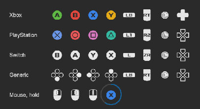
<tb:GamepadGlyph button="South" family="Xbox" />
<tb:GamepadGlyph button="LeftShoulder" family="PlayStation" />
<tb:GamepadGlyph button="East" family="Xbox" class="tb-gamepad-glyph--colored" />
<tb:GamepadGlyph button="South" progress="0.6" />
<tb:InputGlyph glyph="mouse-left" />
<tb:InputGlyph glyph="keyboard-enter" />
row.Add(new GamepadGlyph(GamepadGlyphButton.South, GamepadFamily.Xbox));
row.Add(new InputGlyph("mouse-left"));
row.Add(new InputGlyph(PromptFont.KEYBOARD_ENTER));

// The glyph of a binding, in the look of the gamepad of the player
if (GamepadGlyph.TryGetButton("<Gamepad>/buttonSouth", out var button))
    glyph.Button = button;
glyph.Family = GamepadGlyph.FamilyOf(Gamepad.current.layout);

// A button that the player holds
glyph.Progress = heldSeconds / HOLD_SECONDS;
GamepadGlyph
| Member | Description |
|---|---|
Button (button) |
The button, a GamepadGlyphButton (default South). |
Family (family) |
The look, a GamepadFamily: Generic (default), Xbox, PlayStation or Switch. |
Progress (progress) |
The part of the ring around the glyph that shows, from 0 to 1. See InputGlyph. |
GamepadGlyph.TryGetButton(controlPath, out button) |
Gives the button of an Input System control path, such as "<Gamepad>/buttonSouth" or "<Gamepad>/dpad/up". False for a path that is not a gamepad button. |
GamepadGlyph.FamilyOf(device) |
Gives the family of a device from its layout name or its display name, such as "DualSenseGamepadHID" or "Xbox Controller". An unknown name gives Generic. |
The values of GamepadGlyphButton are the control names of the Unity Input System:
| Buttons | Values |
|---|---|
| Face buttons | South, East, West, North |
| D-pad | DpadUp, DpadDown, DpadLeft, DpadRight, Dpad (the full d-pad) |
| Shoulders and triggers | LeftShoulder, RightShoulder, LeftTrigger, RightTrigger |
| Sticks | LeftStick, RightStick, LeftStickPress, RightStickPress |
| Menu buttons | Start, Select |
- The south button is "A" on an Xbox gamepad, a cross on a PlayStation gamepad and "B" on a Switch gamepad.
Buttonis the place of the button, so one value is correct for each gamepad. - A family with no own glyph for a button shows the generic glyph. The sticks have one look for all families.
StartandSelectare the Menu and View buttons of an Xbox gamepad, the Options and Create buttons of a DualSense, and Plus and Minus of a Switch gamepad.- Both functions take a text, so they work without the Input System package.
InputGlyph
GamepadGlyph is an InputGlyph. Use an InputGlyph for a glyph that is not in the button list.
| Member | Description |
|---|---|
Glyph (glyph) |
The PromptFont name of the glyph, such as "mouse-left", "keyboard-enter", "analog-l-up" or "device-gamepad". A text that is not a name shows as it is, so a PromptFont constant works too. |
Progress (progress) |
The part of the ring around the glyph that shows, from 0 to 1 (default 0). The ring fills clockwise from the top. 0 shows no ring. |
PromptFont.<NAME> |
A constant for each glyph: the character of the glyph, such as PromptFont.MOUSE_LEFT. |
PromptFont.Names |
The names of all glyphs. |
PromptFont.TryGetGlyph(name, out glyph) |
Gives the character of a name. False for a name that the list does not have. |
- The names are the code names of PromptFont. The list has the glyphs of the gamepads, the keys, the mouse and the devices. The glyph page of PromptFont shows each glyph with its name: https://shinmera.com/promptfont
- The name of a constant is the name of the glyph in capital letters with "_" for "-": "xbox-a" is
PromptFont.XBOX_A. - The glyph is text. The USS
coloris its color and the USSfont-sizeis its size (default 20 px). - The ring is outside of the box of the glyph, so the glyph does not move when the ring shows. Give the glyph a margin of about 8 px when it has a ring. A parent with
overflow: hiddencuts the ring. - A glyph has one color. The letter in a button is a hole, so the background shows through it.
Tips:
- Use a Kbd for a keyboard shortcut in a text or a menu: it shows any key name as a cap in the font of the theme. Use an
InputGlyphfor a prompt in a game, where the mouse, the keys and the gamepad buttons have the same look. - Set
Familywhen the player connects a gamepad, so the prompt shows the buttons of the gamepad in the hands of the player. - For a hold or a quick time event, set
Progresseach frame from the time. Set it back to 0 when the player releases the button. - For a glyph in a sentence, put the labels and the glyph in a row with
flex-direction: rowandalign-items: center.
Styling
| Class or property | Element |
|---|---|
tb-input-glyph |
The glyph. color is the color and font-size is the size. |
tb-input-glyph__text |
The text element with the PromptFont font. |
--tb-input-glyph-ring-color |
A custom property on the glyph: the color of the filled part of the ring (--tb-color-accent). |
--tb-input-glyph-ring-track |
A custom property on the glyph: the color of the rest of the ring (--tb-color-border). A transparent color draws no track. |
--tb-input-glyph-ring-width |
A custom property on the glyph: the width of the ring in pixels (3). |
tb-gamepad-glyph |
On each GamepadGlyph. |
tb-gamepad-glyph--generic, --xbox, --playstation, --switch |
The family. |
tb-gamepad-glyph--south, --left-shoulder, --dpad-up, ... |
The button: its name in small letters with "-" between the words. |
tb-gamepad-glyph--colored |
Opt-in. Add it to a glyph for the colors of the face buttons of an Xbox or a PlayStation gamepad. The other buttons keep color. |
.prompt .tb-input-glyph { font-size: 32px; color: var(--tb-color-accent); }
.prompt .tb-input-glyph { --tb-input-glyph-ring-color: var(--tb-color-success); --tb-input-glyph-ring-width: 4; }
.prompt .tb-gamepad-glyph--south { color: var(--tb-color-success); }
License
- The glyphs are from the font PromptFont by Yukari "Shinmera" Hafner, under the SIL Open Font License 1.1. The font and its license are in
Runtime/Resources/UIToolbox/Fonts. SeeThird Party Notices.md. - The shapes and the logos of the buttons of a platform are trademarks of their owners. The license of the font does not give a right to them.
- When you ship a build for a console, follow the rules of the platform holder for button art.