

 GlassPanel
A GlassPanel is a frosted glass container. It blurs the UI behind it, then lays a translucent tint and a light border on the blur. Use it for a pause menu over the game, a HUD card or an item wheel: the player still sees what is behind the panel, but the text on the panel stays easy to read. The GlassDemo example has the three tints and a pause menu.
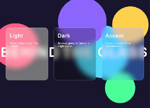
<tb:GlassPanel tint="Dark" blur="12">
    <ui:Label text="Paused" />
</tb:GlassPanel>
var glass = new GlassPanel { Blur = 12, Tint = GlassTint.Dark };
glass.Add(new Label("Paused"));
| Member | Description |
|---|---|
Blur (blur) |
The blur radius in pixels (12). 0 shows the UI behind the panel sharp, as clear glass. |
Tint (tint) |
The color of the glass: Light (white frosted glass, the default), Dark (smoked glass, for text on a bright scene) or Accent (glass in a color, for a selected card). |
- The blur is the USS
backdrop-filter. It shows only the UI behind the panel in the same panel, not the 3D scene. For a scene behind the glass, render the camera to aRenderTextureand show it in an element under the UI. - The children of the panel are the content. The panel is a normal
VisualElement, so it takes any layout.
Glass windows
A window can be glass too. The built-in GlassWindowTemplate chrome blurs the wallpaper and the windows behind the window. Each window chooses its chrome, so glass windows and default windows can share a workspace. The WorkspaceDemo example has three glass windows and one default window.
<tb:Window id="about" title="About" template-uri="UIToolbox/Templates/GlassWindowTemplate" />
A tab group made from a glass window is glass too: the group takes the chrome of the window that you drop on, and its tab strip and pages are tints on the blur.
The blur is 8 pixels, so the windows behind show as frosted shapes. For a stronger frost, set backdrop-filter in your style sheet. A large blur leaves only the colors of the wallpaper.
.tb-window.tb-window--glass {
    backdrop-filter: blur(16px);
}
The theme sets the tint and the border of glass windows. See Custom chrome templates and Theme variables.
.tb-workspace {
    --tb-color-glass: rgba(20, 24, 34, 0.6);
    --tb-color-glass-border: rgba(255, 255, 255, 0.24);
}
Styling
| Class | Element |
|---|---|
tb-glass |
The panel: padding, a rounded corner and a border that is lighter at the top. |
tb-glass--light |
On the panel when Tint is Light. |
tb-glass--dark |
On the panel when Tint is Dark. |
tb-glass--accent |
On the panel when Tint is Accent. The tint is --tb-color-glass-accent. |
A class of your own changes the look. The blur comes from Blur, not from the class:
.my-glass {
    background-color: rgba(255, 120, 200, 0.2);
    border-top-color: rgba(255, 255, 255, 0.7);
    border-radius: 16px;
}